Preview image. Unlock full-res
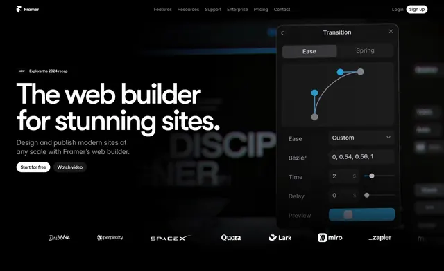
Dark full-bleed hero with a left oversized headline and dual CTAs, a floating Transition settings panel on the right over a dimmed background, and a customer logo row beneath.
Summary
A dark, asymmetric hero that puts an oversized left-aligned headline and two CTAs against a dimmed background, with a floating Transition (easing) editor panel overlapping from the right and a greyscale customer logo row along the bottom.
Visual description
A black top bar carries the Framer wordmark, a center nav (Features, Resources, Support, Enterprise, Pricing, Contact), a Login link, and a white Sign up pill. The left half holds a small "NEW" pill with "Explore the 2024 recap", then a very large white two-line headline "The web builder for stunning sites.", two lines of grey sub-copy, and a white Start for free button beside a dark Watch video button. The right side is dominated by a floating dark UI panel titled Transition, with Ease/Spring tabs, a draggable bezier curve graph with blue handles, and fields for Ease, Bezier (0, 0.54, 0.56, 1), Time, Delay, and a Preview slider. The whole background is a dimmed, blurred dark scene. A row of greyscale customer logos (Dribbble, Perplexity, SpaceX, Quora, Lark, Miro, Zapier) runs across the bottom.
Key takeaway
Floating a real, detailed product control panel (the easing/bezier editor) into the hero shows the tool's depth far better than a flat screenshot would. Anchoring an oversized left headline against a dimmed full-bleed background keeps the type dominant while the UI panel adds proof.
Reuse notes
Best for a design or developer tool whose credibility comes from showing actual interface controls. The floating panel must be genuinely legible and on-brand or it reads as clutter. Dark, asymmetric layout; pairs naturally with a logo row to close the fold.