Preview image. Unlock full-res
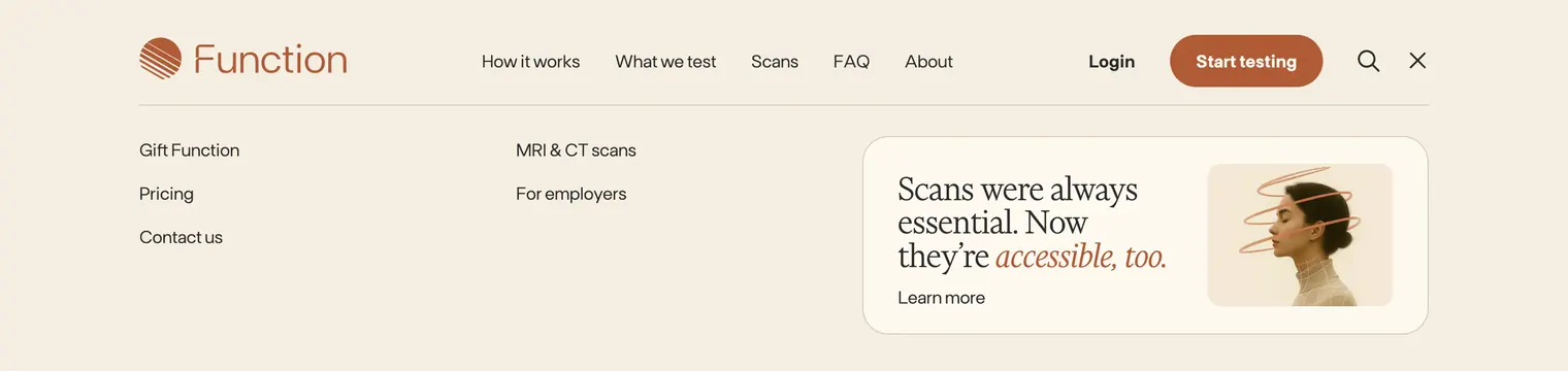
Expanded Function navbar with primary links, login and start-testing actions, and a three-column mega menu featuring a scans promotional card.
Summary
Function's open navigation state shows a slim header bar plus a full-width cream dropdown with utility links in two columns and a featured scans card on the right.
Visual description
Top bar on cream: terracotta Function logo with circular line icon left; centered sans links for How it works, What we test, Scans, FAQ, and About; right side has Login text, filled terracotta pill "Start testing," magnifying-glass search icon, and close X indicating the menu is expanded. A thin rule separates the bar from the dropdown panel. Below, three zones sit on generous whitespace: left column lists Gift Function, Pricing, and Contact us; middle column lists MRI and CT scans and For employers; right column holds a large rounded cream card with serif headline "Scans were always essential. Now they're accessible, too." where the second clause is rust italic, a Learn more link with arrow beneath, and a square portrait of a person in profile with a terracotta spiral graphic encircling the head.
Key takeaway
Keeping most links as plain text columns while reserving one editorial card for the hero product avoids over-designing every nav item. The close X in the header makes the expanded state feel intentional rather than a hover accident.
Reuse notes
Fits health, SaaS, or consumer brands with a flagship offering to promote inside navigation. The featured card needs strong photography or illustration; slim link columns work without icons. Pair with a collapsed navbar item for contrast.