Preview image. Unlock full-res
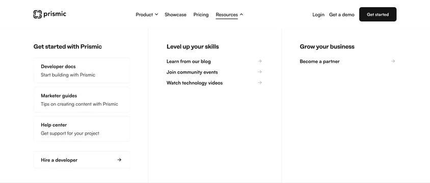
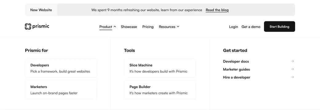
Light three-column Product mega menu with audience cards, tool cards, and get-started links beneath the main navbar.
summary
An expanded Product mega menu under the Prismic navbar, organized into three labeled columns for audiences, tools, and getting started.
Visual description
Top gray announcement banner with "New Website" badge and blog link. White navbar shows Prismic logo, Product (active, underlined with up-caret), Showcase, Pricing, Resources, plus Login, Get a demo, and black "Start Building" button. The dropdown fills a white panel in three columns: "Prismic for" with Developers and Marketers bordered cards; "Tools" with Slice Machine and Page Builder cards; "Get started" with text links (Developer docs, Marketer guides, Hire a developer) each followed by a right arrow. Cards use light gray borders and short subtext.
Key takeaway
Audience-first column ("Prismic for") before product tools mirrors how buyers self-segment. Bordered cards inside the menu make dense links scannable without feeling like a sitemap.
Reuse notes
Best for multi-persona SaaS nav where dev and marketer paths diverge early. Requires disciplined copy on each card subline. The announcement banner adds height; omit it on simpler sites.