Preview image. Unlock full-res
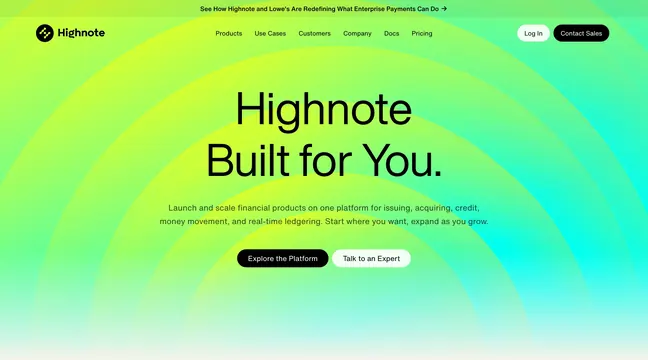
Two-tier navbar with centered links, pill auth buttons, and a lime-to-mint diagonal gradient backdrop plus top promo strip.
Summary
Global header only: thin centered promo banner above logo-left, link-center, dual-pill-CTA-right navigation on a vivid green gradient field.
Visual description
Abstract diagonal gradient washes from chartreuse left to seafoam right. Top announcement strip reads "See How Highnote and Lowe's Are Redefining What Enterprise Payments Can Do" with trailing arrow. Main bar shows circular green Highnote mark plus wordmark left; centered text links for Products, Use Cases, Customers, Company, Docs, Pricing; right pair of pill buttons with white "Log In" and filled black "Contact Sales."
Key takeaway
Letting the navbar inherit a hero-grade gradient makes the header feel part of the brand moment rather than a detached white bar. Dual pill CTAs cleanly separate self-serve login from sales.
Reuse notes
Works for bold fintech brands comfortable with color at the very top. Gradient nav needs sufficient contrast on links; sticky states may require a solid fallback.