Preview image. Unlock full-res
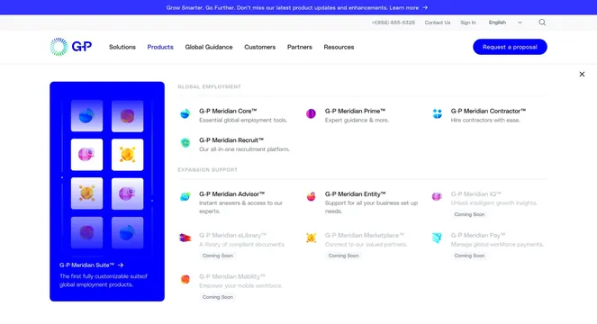
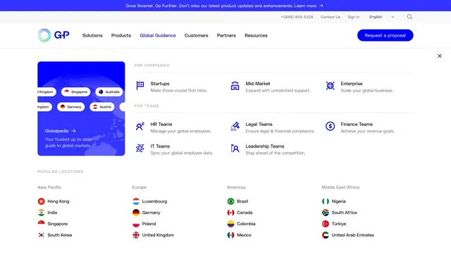
Expanded Customers nav dropdown with a gradient promo card, featured Deliverect case study, and Globetrotters community tile over full site header chrome.
Summary
The Customers item in G-P's primary nav opens a three-column mega menu mixing a teal gradient story card, a bold blue featured customer tile, and a neutral community entry.
Visual description
Full header stack visible: blue announcement bar, utility row with phone, Contact Us, Sign In, language selector, and search, then white main nav with G-P logo, six top-level links (Customers active in blue), and a filled blue "Request a proposal" button. The dropdown panel is white with a close X in the upper right. Left card uses a light teal-to-blue gradient, "Customer Stories" title with arrow, supporting copy, and a vertical strip of client logos (deliverect, Karger, ClickDimensions, aurora). Center card is solid bright blue with white deliverect logo and a large white headline on Deliverect's global expansion. Right card is light gray with a circular search-person icon, "G-P Globetrotters" link, and short community copy.
Key takeaway
Balancing wayfinding (stories index), social proof (one hero case study), and community in three distinct visual weights without a dense link list. The logo strip on the promo card adds credibility without leaving the menu.
Reuse notes
Useful for B2B sites where the Customers nav must surface proof and community, not just links. Requires strong photography or brand color blocks for the featured tile. Mega menu assumes desktop width; mobile would need a different pattern.