Preview image. Unlock full-res
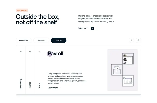
Tabbed services section with split headline, pill tab controls, and a bordered panel pairing payroll copy with line-art UI illustrations.
Summary
A services overview pairing a split headline row with pill tabs and a large bordered content panel that switches between Accounting, Finance, and Payroll with matching illustrations.
Visual description
Off-white page with a top row split left and right. Left: peach pill badge "our services" above a large navy headline "Outside the box, not off the shelf." Right: gray supporting copy on tailored solutions plus a "What we do" text link with a small navy square arrow button. Below, three horizontal pill tabs read Accounting, Finance, and Payroll; Payroll is active in filled navy while the others are white outlined. Far right, circular prev/next arrow controls sit beside the tab row. A large rounded rectangle with a thin gray border holds the tab body. Left edge: a vertical numbered index (01 Accounting, 02 Finance, 03 Payroll) with Payroll bolded. Center: large "Payroll" heading with a soft purple circle behind the P, gray paragraph on compliant payroll systems, and a "Learn More" arrow link. Right: a light gray square with three stacked mini-cards of thin line-art icons showing employee rows, an envelope with a dollar document, and a calendar with clock and magnifier.
Key takeaway
Pill tabs plus a vertical numbered rail inside the panel make the same three services scannable two ways without duplicating content. Line-art micro-illustrations in boxed tiles keep the right column lightweight compared to a product screenshot.
Reuse notes
Strong for professional services sites selling multiple related offerings (accounting, finance, HR). Needs crisp tab interaction and consistent icon style across service panels. The split headline row needs enough width; stack headline and subcopy on smaller breakpoints.