Preview image. Unlock full-res
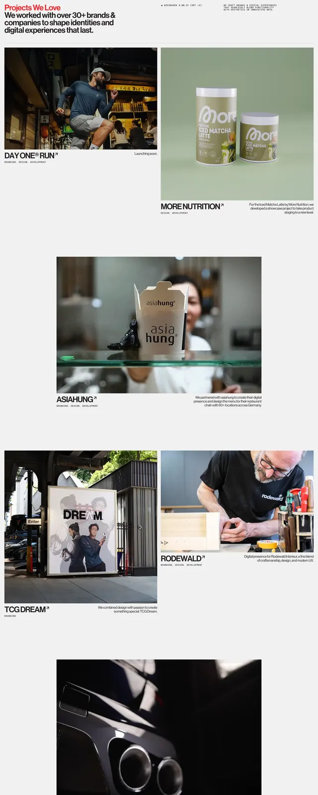
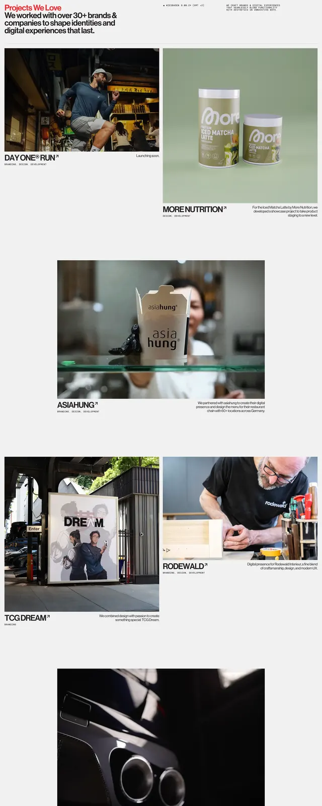
Light editorial portfolio grid titled Projects We Love with alternating two-column and full-width case-study rows, red accent headline, and service-tag labels per project.
Summary
A long-form agency portfolio section pairing a red-and-black Projects We Love headline with an alternating grid of large project photography, arrow-linked titles, and caps service tags.
Visual description
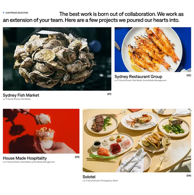
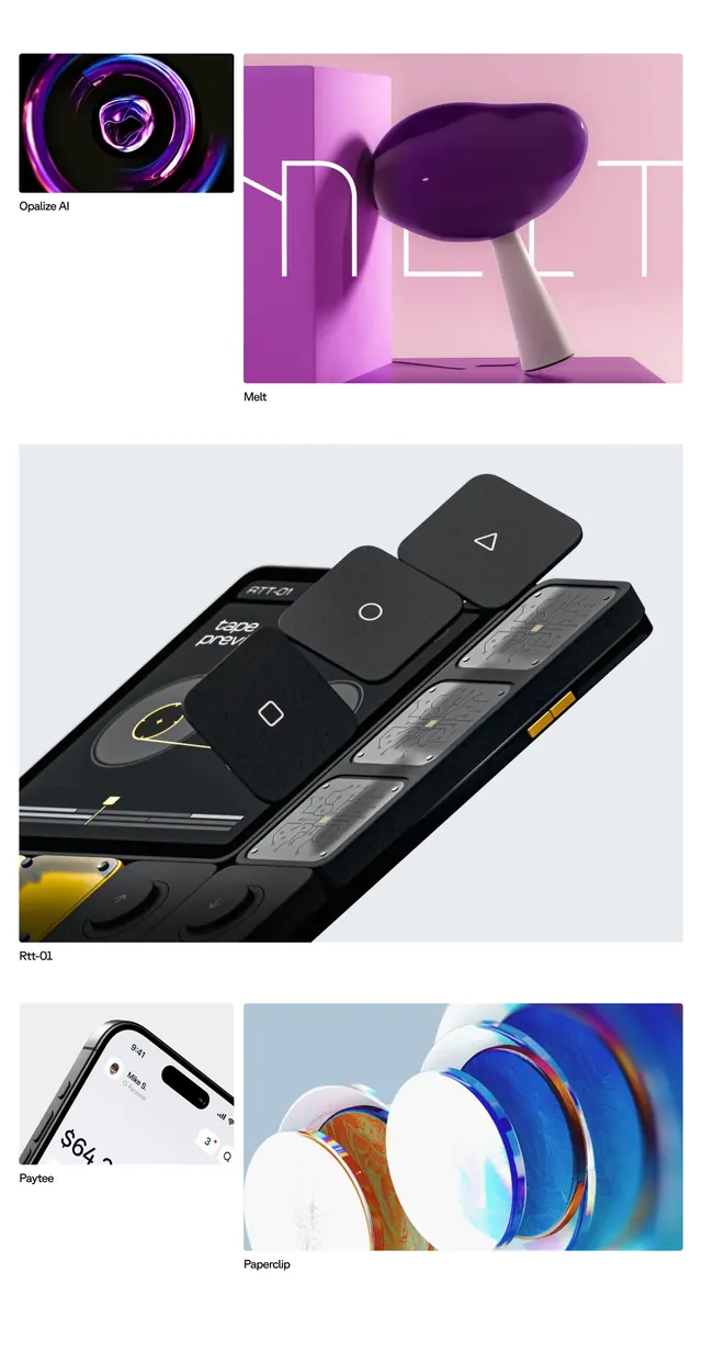
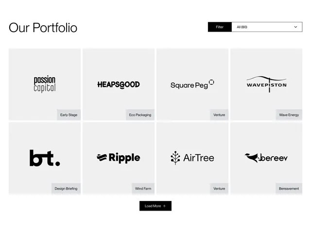
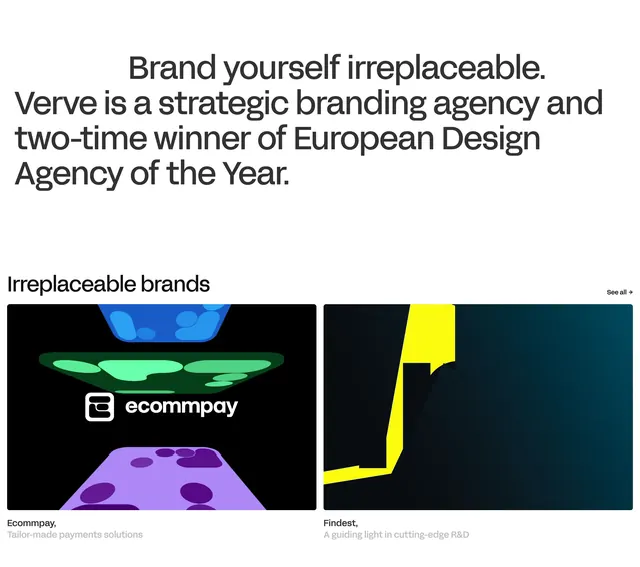
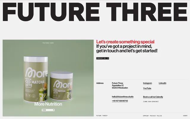
Light gray background with generous vertical spacing. Header row: left stacks a two-tone headline with Projects in red and We Love in black, plus a subline about 30+ brands; right holds small caps metadata reading STRATEGIC DESIGN UNIT and a short mission paragraph. Project rows alternate between two-up and full-width layouts. Each entry leads with a dominant photo, then a bold all-caps project name with an upward arrow, hyphen-separated service tags such as BRANDING, DESIGN, and DEVELOPMENT, and a short description or status line aligned to the side. Visible projects include DAY ONE RUN with a night street runner and Launching soon status, MORE NUTRITION with sage-green product staging, full-width ASIAHUNG with a takeout-box restaurant scene, side-by-side TCG DREAM poster and RODEWALD workshop craft shots, and full-width LUBOSS with a low-angle car exhaust detail.
Key takeaway
Alternating two-column and full-bleed rows keeps a long portfolio scannable without a uniform card grid. Red on only the first headline word creates brand accent without a full color system. Arrow suffixes on project titles signal outbound case-study links while caps service tags replace iconography.
Reuse notes
Ideal for creative studios showcasing mixed branding, product, and environmental work. Requires strong photography at varied aspect ratios. Light gray field and minimal chrome suit editorial agency sites; less suited to dense SaaS product grids.