Preview image. Unlock full-res
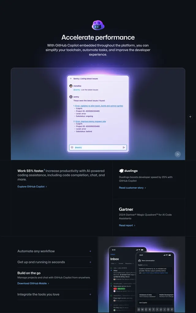
Dark multi-layer GitHub Copilot section with a glowing chat demo, stat and logo proof cards, and an accordion beside mobile app mockups.
Summary
A tall GitHub marketing block for Copilot that stacks a hero chat simulation, a three-card proof grid, and a bottom accordion paired with glowing phone mockups.
Visual description
Deep charcoal background with purple-blue glow accents. Top center: small glowing Copilot robot icon, white headline "Accelerate performance", and gray subcopy about Copilot embedded across the platform. Below, a large rounded dark-blue container holds a bright chat window titled "Sentry: Listing latest issues" showing a user prompt and bot reply listing two errors with metadata fields; up-arrow and play controls sit outside the frame. Mid section is a three-part grid: left card reads "Work 55% faster." with productivity copy and blue "Explore GitHub Copilot" link; top-right Duolingo logo card cites 25% developer speed with customer story link; bottom-right Gartner logo card references 2024 Magic Quadrant with report link. Bottom band splits left accordion list with plus icons on collapsed rows and expanded "Build on the go" showing mobile description and download link; right side shows two overlapping phone mockups with purple glow, front phone on GitHub Inbox notifications, rear phone on Copilot mobile chat with keyboard and query chips.
Key takeaway
Layer demo, social proof, and expandable features in one scroll without visual fatigue: glow-framed product moment first, compact logo cards second, accordion plus device preview last. Purple rim light on UI chrome ties dark sections together. One expanded accordion item anchors the bottom half while others stay collapsed.
Reuse notes
Reference layout for developer platforms selling AI assistants. Needs real product UI, credible logos, and stat sources. Section is very tall; consider breaking into separate pages on mobile. Glow and 3D phone renders only work on dark backgrounds.