Preview image. Unlock full-res
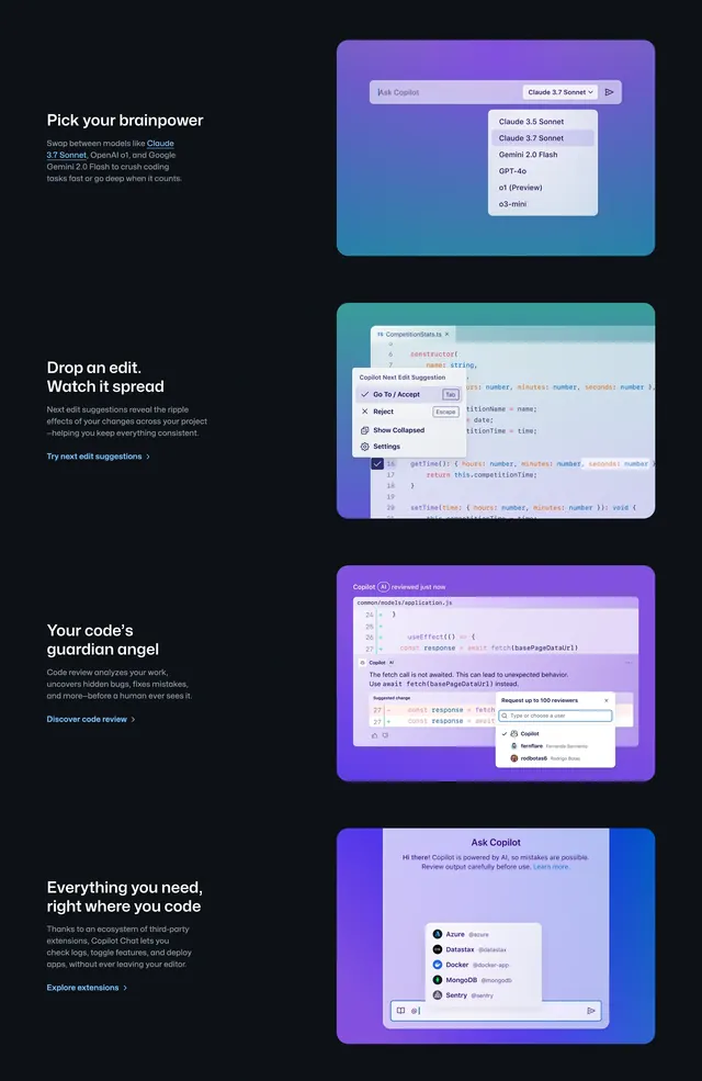
Dark four-row features section alternating copy left with gradient UI mockups for model pick, next edit, code review, and extensions.
Summary
A tall GitHub Copilot features block that stacks four alternating text-and-mockup rows, each selling a distinct capability with its own gradient UI vignette.
Visual description
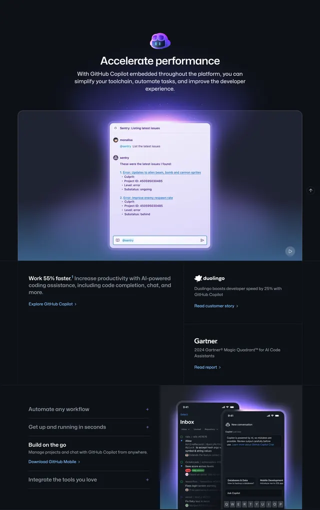
Near-black full-width background. Four horizontal bands, each with white left-aligned headline and gray body copy plus a blue text link ("Try next edit suggestions >", "Discover code review >", "Explore extensions >"). Right side of each row holds a rounded card on a unique purple, teal, or blue gradient: (1) model dropdown in an Ask Copilot bar listing Claude 3.5/3.7 Sonnet, Gemini 2.0 Flash, GPT-4o, o1, o3-mini; (2) code editor with a Copilot Next Edit Suggestion popup over TypeScript; (3) pull-request diff view with Copilot AI comment and suggested change plus a reviewer-picker panel; (4) Ask Copilot chat with @-triggered extension list (Azure, Datastax, Docker, MongoDB, Sentry). Headlines read "Pick your brainpower", "Drop an edit. Watch it spread", "Your code's guardian angel", and "Everything you need, right where you code".
Key takeaway
One repeatable row pattern (headline, short copy, link, gradient mockup) scales to many features without layout reinvention. Each mockup uses a different gradient hue so the scroll stays visually distinct.
Reuse notes
Works for developer products with several discrete capabilities to explain below the hero. Needs authentic UI captures per feature. Long vertical section; best on marketing pages with room to scroll.