Preview image. Unlock full-res
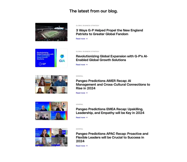
Centered blog index list with five recent posts, each shown as a horizontal row of thumbnail plus category, title, and read link.
Summary
A simple "latest posts" block on white with a bold centered heading and a vertical stack of image-plus-text blog rows.
Visual description
White background with generous vertical spacing. Centered bold black heading reads "The latest from our blog." Below, five blog entries repeat the same pattern: rounded rectangular thumbnail on the left, text block on the right. Each row shows a small grey uppercase category label (mostly "GLOBAL BUSINESS STRATEGY" or "GENERAL"), a bold black multi-line title, and a blue "Read more" link with arrow. Thumbnails vary: a stadium aerial photo, a branded graphic card with G-P AI messaging, and several video-call collage screenshots. Rows are separated by ample whitespace with no dividers.
Key takeaway
The horizontal list row as a lighter alternative to a card grid: one consistent thumbnail size, category as metadata, title as the anchor, link as the only CTA. No dates or author clutter keeps scanning fast.
Reuse notes
Reliable pattern for corporate blogs that prioritize readability over visual density. Thumbnails should be cropped consistently; mixed aspect sources still work because each sits in the same left column slot. Pair above or below a stronger hero featured post.