Preview image. Unlock full-res
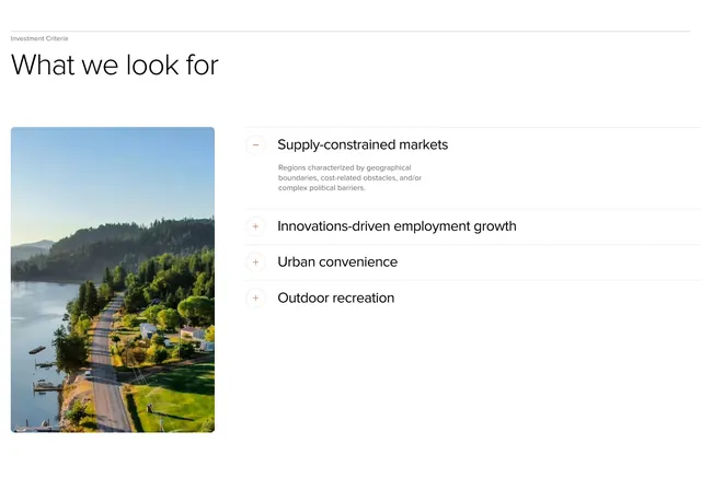
Light two-column features section pairing a tall rounded landscape photo with an accordion list of four investment criteria under a "What we look for" headline.
Summary
A crisp white section that introduces investment criteria through a large rounded landscape photograph on the left and a four-item accordion on the right, led by a small label and bold "What we look for" heading.
Visual description
White background with generous padding. Top left, a small grey label reads "Investment Criteria" above a large black sans-serif headline "What we look for". Below, a two-column split: left, a tall vertical photo with soft rounded corners showing a road beside water and forested hills; right, an accordion with thin grey dividers. The first row, "Supply-constrained markets", is expanded with a minus icon in a circle and body copy about geographical and political barriers. Three collapsed rows follow with plus icons: "Innovations-driven employment growth", "Urban convenience", and "Outdoor recreation". Typography stays restrained: black titles, grey supporting text.
Key takeaway
Pairing a mood-setting landscape image with a scannable accordion keeps dense criteria readable without a wall of text. Circular plus/minus icons give clear expand/collapse affordance while staying minimal. The small section label above an oversized question-style headline creates a calm editorial hierarchy.
Reuse notes
Works well for investment firms, funds, or B2B services explaining selection criteria or capabilities. The image should reinforce the brand thesis (here, nature and place). Accordion pattern suits four to six items; more rows may feel long on mobile when stacked.