Preview image. Unlock full-res
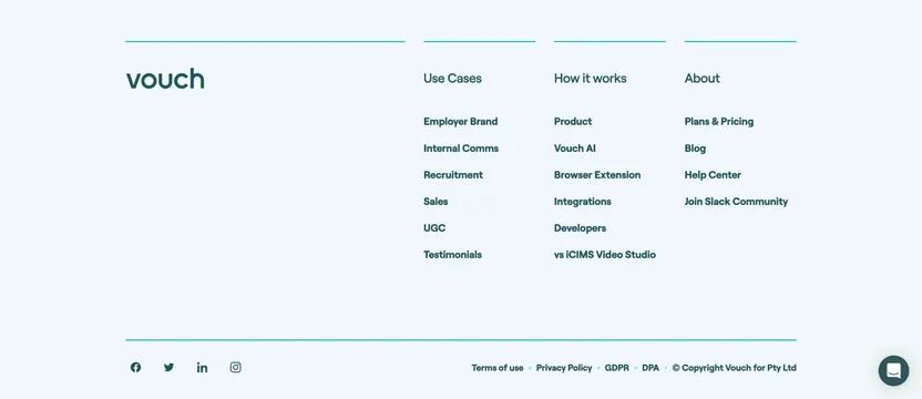
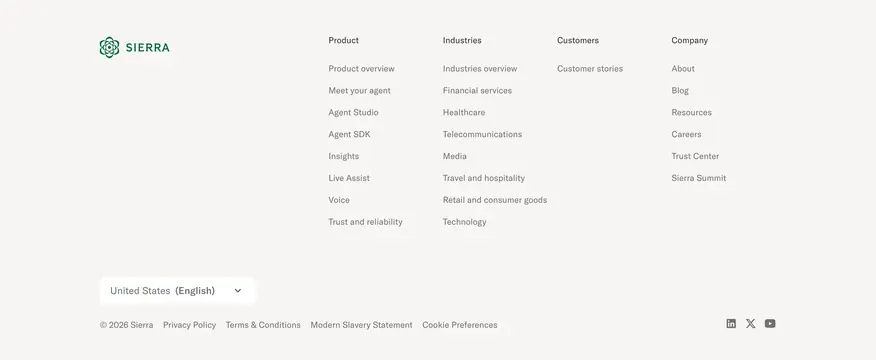
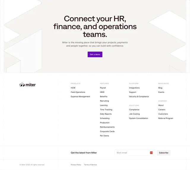
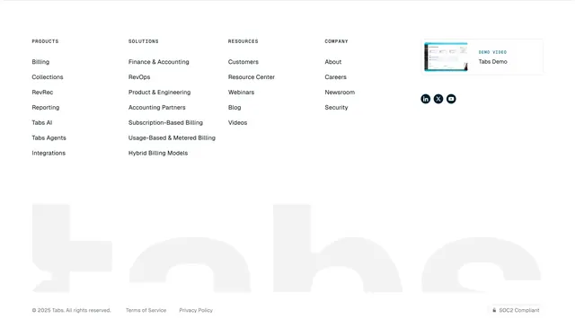
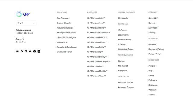
Five-column light footer with logo, language selector, contact and social row, and grouped sitemap links across solutions, products, and resources.
Summary
A wide white footer that mirrors the main nav taxonomy in five link columns plus a branded contact and social block on the left.
Visual description
White background with the G-P logo (gradient circle mark plus blue wordmark) in the first column. Below it, an English language dropdown, expert phone line, support contact link, and a row of six black square social icons (email, Facebook, LinkedIn, YouTube, Instagram, X). Remaining columns use small gray uppercase section labels with stacked black link lists: SOLUTIONS (eight links including Integrations and Developers Portal), PRODUCTS (long G-P Meridian product line list), GLOBAL GUIDANCE plus FOR TEAMS, FOR COMPANIES, and CUSTOMERS groupings, and COMPANY, PARTNERS, and RESOURCES groupings on the far right. No newsletter form or legal fine print visible in the capture.
Key takeaway
Repeating the same nav groupings from the header in the footer reduces cognitive load for enterprise sites with deep IA. Keeping social and contact in the logo column gives the left edge a human anchor before the link grid.
Reuse notes
Suits large B2B sites with many product SKUs and audience-based paths. Five columns need desktop width; stack by group on mobile. Gray label caps over black links create hierarchy without heavy dividers.