Preview image. Unlock full-res
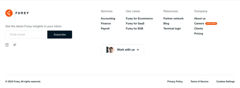
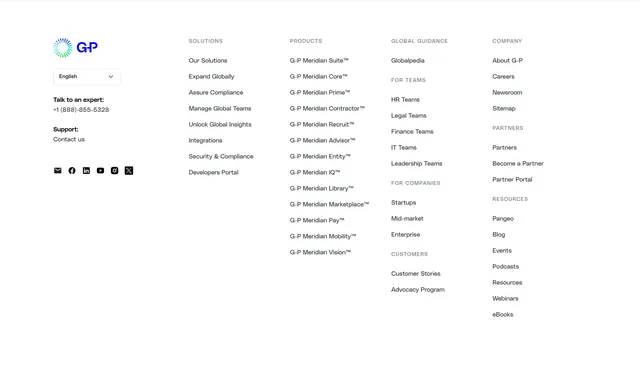
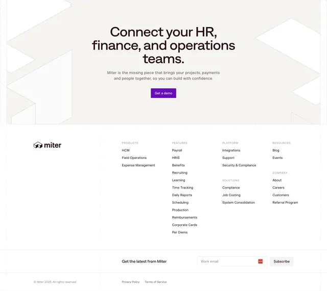
Light multi-column footer with a CTA hero band above and a newsletter signup row, organized into five link groups.
Summary
A footer that stacks a centered CTA band on top of a wide multi-column link directory and a newsletter signup row. The defining feature is the pale beige hero band with large outlined geometric shapes leading directly into the white footer grid.
Visual description
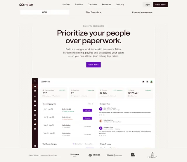
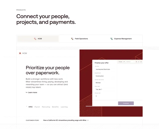
The top band is pale beige with faint outlined chevron and arrow shapes at the edges; centered within it is a three-line black headline, "Connect your HR, finance, and operations teams.", a two-line muted subhead, and a solid violet "Get a demo" button. Below, on white, the Miter wordmark with a small cube glyph sits at far left while the link area spreads across labeled groups: PRODUCTS, FEATURES, PLATFORM, SOLUTIONS, RESOURCES and COMPANY, each with a vertical list of plain text links. Faint dashed vertical and horizontal rules divide the layout into a grid. A lower row reads "Get the latest from Miter" beside a "Work email" input with a small red icon and a grey "Subscribe" button. A thin bottom bar carries the copyright, Privacy Policy and Terms of Service.
Key takeaway
Folding the final demo CTA into the top of the footer so the page closes with one clear conversion prompt before the link directory. The faint dashed grid lines and outlined geometric shapes add structure and brand texture to an otherwise plain footer.
Reuse notes
A solid default for a content-heavy B2B site with many feature and solution pages to surface. The CTA band plus link grid plus newsletter row covers conversion, navigation and capture in one section. Works on light backgrounds; the dashed grid and outline shapes are the only ornament, so they need to align cleanly to look intentional.