Preview image. Unlock full-res
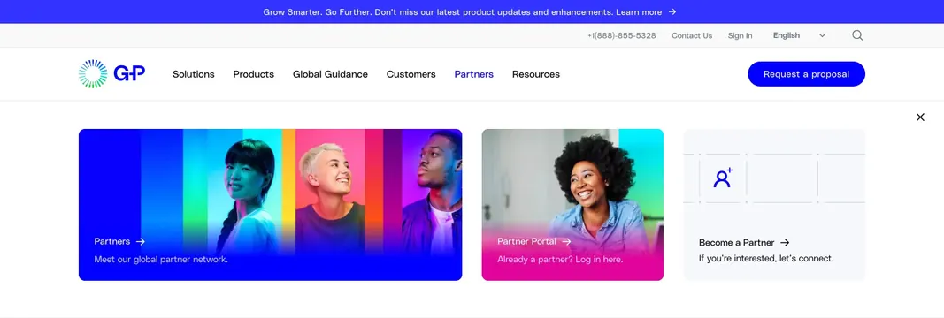
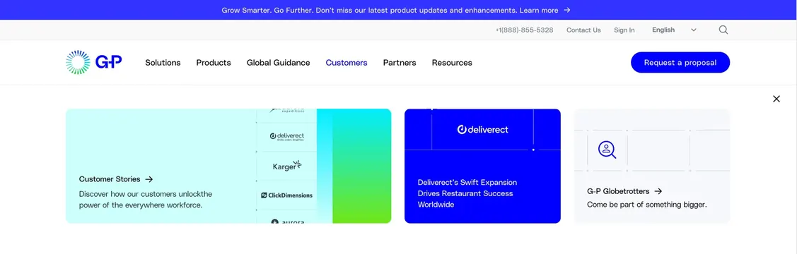
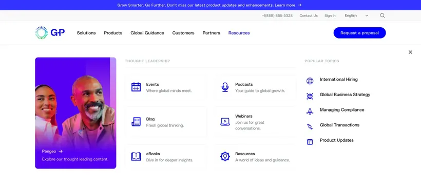
Expanded Resources dropdown with a featured Pangeo card, a six-item thought leadership grid, and a popular topics link list under the G-P navbar.
Summary
The Resources mega menu balances one tall featured content card against a structured icon grid and a compact popular-topics list, all within a full-width white overlay below the main nav.
Visual description
A dark blue announcement bar and utility row (phone, Contact Us, Sign In, language selector, search) sit above the white header with the G-P logo, primary nav links, and a blue "Request a proposal" button. Resources is active in blue. The dropdown spans nearly full viewport width with a close X in the upper right. Left column shows a tall purple-to-violet gradient card with a photo of two people and bottom copy "Pangeo ->" plus "Explore our thought leading content." Center column labeled THOUGHT LEADERSHIP holds a 2x3 grid: Events, Blog, eBooks, Podcasts, Webinars, and Resources, each with a blue line icon, bold title, and gray one-line description. Right column POPULAR TOPICS lists five links with small blue icons: International Hiring, Global Business Strategy, Managing Compliance, Global Transactions, and Product Updates.
Key takeaway
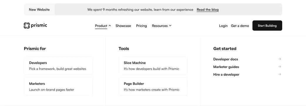
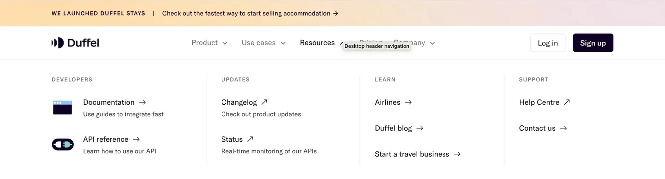
Pairing one editorial hero card with a scannable icon matrix and a slim topic index keeps resource navigation both promotional and utilitarian. Repeated blue iconography and short supporting lines make dense menus feel organized without cards everywhere.
Reuse notes
Strong pattern for content-heavy B2B SaaS with blogs, events, and guides. Needs photography for the featured card and consistent icon set. The three-column split works when one flagship property (Pangeo) deserves visual priority over the rest.