Preview image. Unlock full-res
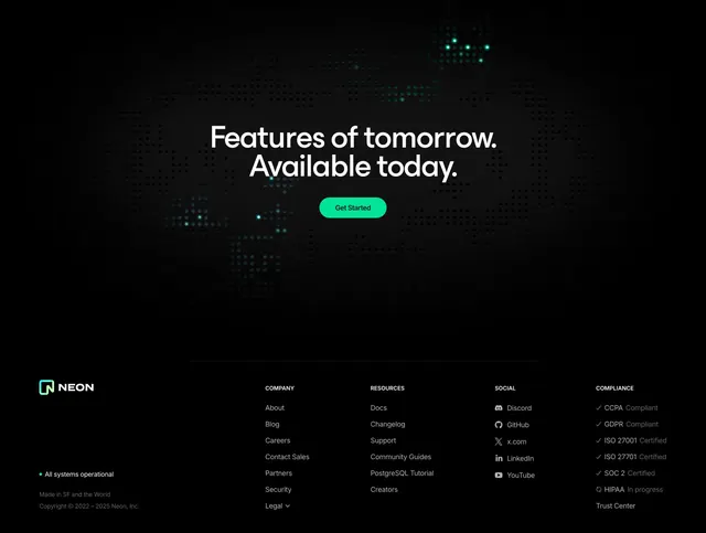
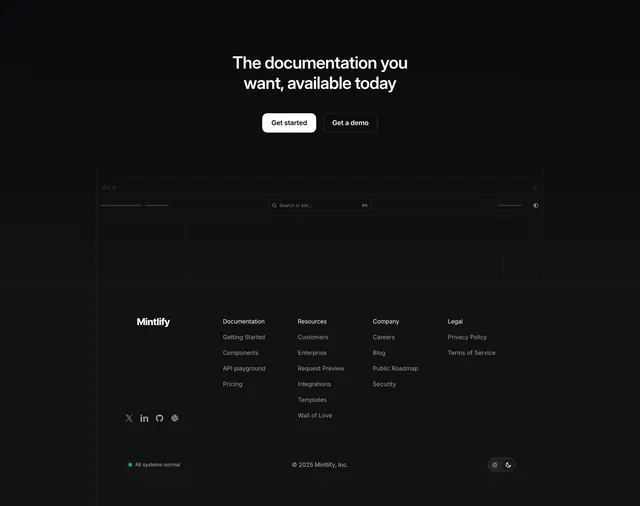
Dark, near-black footer pairing a repeated CTA headline and twin buttons above a four-column link directory with status and theme controls.
Summary
A near-black footer that opens with a repeated two-line CTA headline and twin buttons, then drops a four-column link directory, a live status pill, and a light/dark theme toggle along the bottom.
Visual description
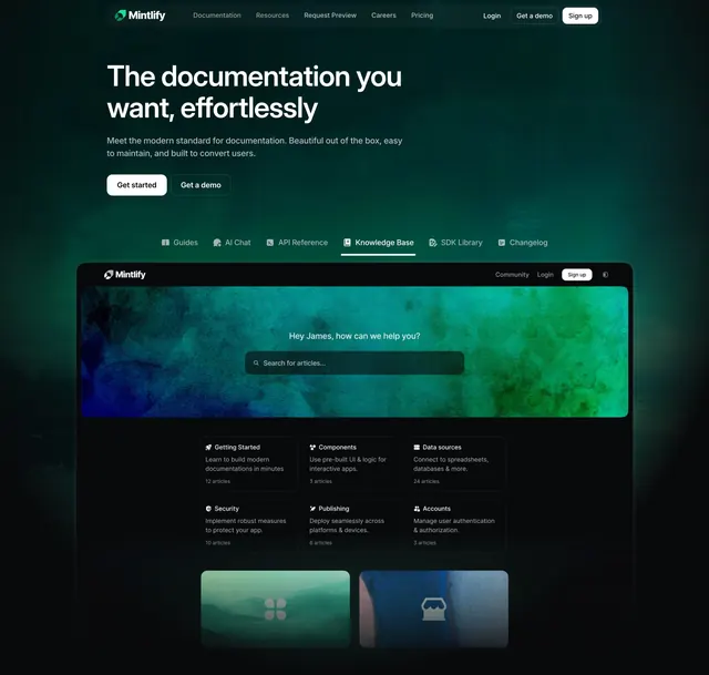
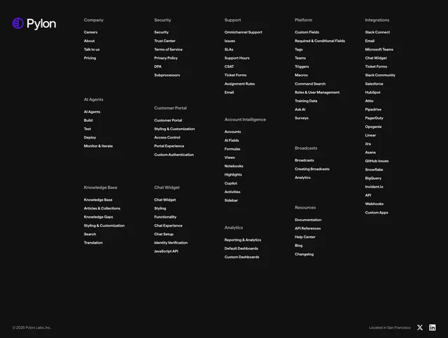
On a flat near-black field, a centered two-line headline "The documentation you want, available today" sits above two pill buttons: a white filled "Get started" and a dark outlined "Get a demo." Beneath, a very faint outlined sketch of a docs UI (window dots, a centered "Search or ask..." field with a key hint, a left sidebar, an empty content panel) hints at the product without a real screenshot. The footer proper has the white "Mintlify" wordmark left, then four labeled link columns (Documentation, Resources, Company, Legal) in grey. A bottom row holds a green-dot "All systems normal" status pill at left, a centered "2025 Mintlify, Inc." copyright, and a sun/moon theme toggle at right. Social icons (X, LinkedIn, GitHub, Slack) sit under the wordmark.
Key takeaway
The ghosted line-art outline of the product UI fills the dark space and reinforces what the tool is without the weight of a full screenshot. A live "All systems normal" status pill in the footer quietly signals reliability, exactly the trust cue a developer-tool buyer checks for. Repeating the primary CTA at the footer gives the page a second close.
Reuse notes
Fits documentation, infra, and developer tools where uptime and a clean dark aesthetic matter. The status pill should link to a real status page or it reads as decoration. The faint UI outline only works on a flat dark background with very low-contrast strokes.