Preview image. Unlock full-res
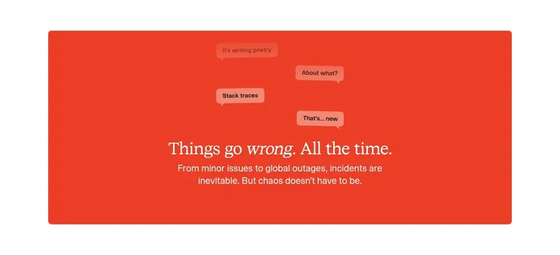
Bold red rounded panel with a serif statement headline and scattered floating chat-bubble snippets above it.
Summary
A contained vivid-red panel that pairs a confident serif statement with a loose cluster of chat-style message bubbles, giving a plain value proposition a conversational, human texture.
Visual description
A rounded rectangle fills with a bright red-orange background on a white page. In the upper area, four small pill-shaped chat bubbles ("It's writing poetry", "About what?", "Stack traces", "That's... new") float at staggered positions in slightly tinted shades, each with a little tail. Below them, centered, a serif headline reads "Things go wrong. All the time." with "wrong" set in italic for emphasis. A two-line sans-serif subhead in lighter weight follows. Type is white, sitting high-contrast on the saturated panel.
Key takeaway
Mixing a formal italic-accented serif headline with informal scattered chat bubbles to make a statement feel both authored and conversational. Using one saturated brand color as a full contained panel to make a value-prop section pop between calmer neighbors.
Reuse notes
Good for a value-proposition or transitional section that needs personality and a strong color break. The serif-plus-bubble contrast suits products about communication, incidents, or chat. Works on a single brand color; tune bubble tints so the playful elements read clearly against the saturated field.
More value proposition sections
See all




More like this




Keep what you find
A free account saves references to boards and can send you a weekly email of picks based on what you save.
To see every result, go Pro.