Preview image. Unlock full-res
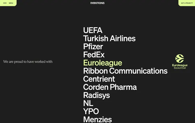
Dark client proof section with a vertical stack of oversized brand names and a lime highlight that reveals the active logo.
Summary
A dark client section that replaces a logo wall with a tall typographic list, highlighting one name in lime green and pairing it with the matching mark.
Visual description
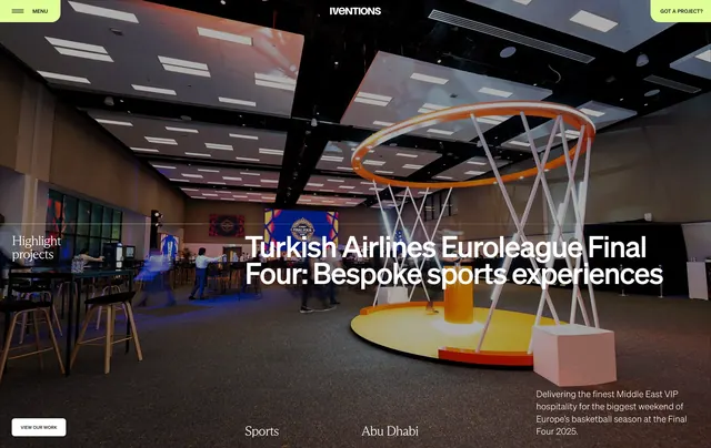
Near-black full-bleed canvas with a small serif intro line on the left reading "We are proud to have worked with." A centered vertical stack of oversized sans-serif client names runs down the right half in white, with Euroleague highlighted in lime green and its basketball logo revealed beside it. The top bar shows a lime MENU pill, centered IVENTIONS wordmark, and a lime GOT A PROJECT? CTA.
Key takeaway
Turning client proof into editorial type at billboard scale, then using a single accent color to reveal the logo only on the active name. Keeps dozens of brands readable without a cramped grayscale grid.
Reuse notes
Strong for agencies with recognizable name clients. Needs bold sans type and enough vertical space; works best on dark backgrounds with one neon accent.