Preview image. Unlock full-res
A bold agency portfolio site with a neon lime and black editorial palette, oversized serif headlines, and case-study driven storytelling.
Summary
A bold agency portfolio site with a neon lime and black editorial palette, oversized serif headlines, and case-study driven storytelling.
Visual description
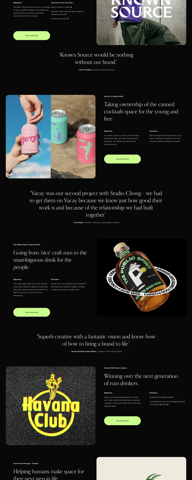
The page opens with a full-width neon lime hero featuring a centered serif headline and a minimal top navigation. A jagged black divider cuts into the green area before the layout shifts to a dark, highly editorial body with large centered messaging, image cards, and bright pill-shaped call-to-action buttons. Lower sections alternate between a quote block, a split case-study layout with text on the left and a product image on the right, a scrolling-style brand strip, and a footer-like contact area.
Key takeaway
The strongest move is the stark lime-and-black contrast paired with elegant serif typography, which makes the agency feel both upscale and disruptive. The zigzag transition between sections adds a memorable visual signature without relying on heavy decoration.
Reuse notes
Works well for creative agencies, branding studios, and portfolio sites that want a fashion-editorial feel. Reuse the color break, oversized centered type, and case-study storytelling when the goal is to signal taste and confidence quickly.