Preview image. Unlock full-res
Four colorful illustrated pillar cards (Canvas, Studio, Jasper IQ, Trust) under a centered serif headline and navy CTA.
Summary
A four-pillar feature row where each capability gets its own pastel illustrated card in a different color, sitting under a centered serif headline, intro, and navy button. The block trades minimalism for a colorful, branded set of product pillars.
Visual description
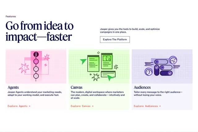
A small monospace-style "The Jasper Platform" eyebrow leads a centered single-line serif headline "The agentic platform that transforms marketing", a short centered intro paragraph, and a filled dark-navy "Explore The Platform" button. Below run four equal cards, each a different pastel fill (green, pink, blue, yellow) with a faint grid texture: Canvas, Studio, Jasper IQ, and Trust. Each card sets its name large in a serif face at the top, a flat black line illustration in the middle (document and arrows, workflow nodes, an atom-like diagram, a shielded figure), and a short two-line description with a right arrow at the bottom.
Key takeaway
Giving each pillar its own pastel color plus a custom line illustration makes four features feel like four distinct products while staying one cohesive row. The serif card titles against flat editorial illustrations read as confident and brand-forward. The centered serif intro with a single dark CTA keeps the colorful grid grounded.
Reuse notes
Reach for this when you want personality and have the budget for custom per-card illustrations; the section leans on that artwork to work. Best for brand or platform-overview pages rather than dense technical specs. Keep the pastel set harmonized and the illustration style consistent across all four cards, or the row loses cohesion.