Preview image. Unlock full-res
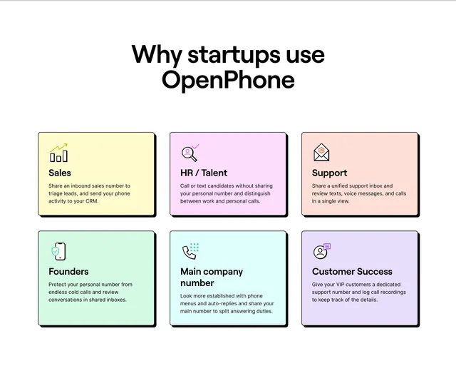
Centered headline above a 2-by-3 grid of neo-brutalist pastel cards, each pairing a line icon with a startup use-case benefit.
Summary
A "Why startups use OpenPhone" section with six persona-based benefit cards in a pastel neo-brutalist grid, each with a thin border and offset black shadow.
Visual description
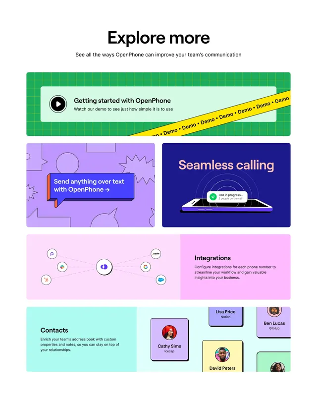
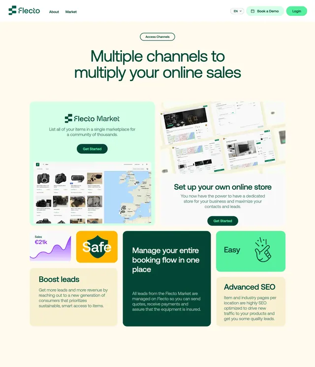
White background with a large centered black sans headline "Why startups use OpenPhone." Below, a two-row by three-column grid of rectangular cards. Each card has a thin black border, solid black offset shadow to the bottom-right, and a unique pastel fill: pale yellow (Sales), pink-lavender (HR / Talent), peach (Support), mint green (Founders), cyan (Main company number), and violet (Customer Success). Top-left of each card holds a simple line-art icon with a small accent color. Bold card title and smaller gray body copy describe the use case: shared sales numbers and CRM logging, candidate outreach without personal numbers, unified support inbox, founder number protection, company phone menus, and VIP customer success lines with call recordings.
Key takeaway
Persona-labeled cards let one section speak to multiple buyers without separate pages. Neo-brutalist shadow plus pastel fill adds personality while staying readable. Consistent card anatomy (icon, title, one paragraph) scales to any grid count.
Reuse notes
Strong for horizontal SaaS products serving many team functions. Pastel palette needs six distinct hues; reduce columns on mobile. Offset shadows add charm but can feel busy if the rest of the page is already heavy on borders.