Preview image. Unlock full-res
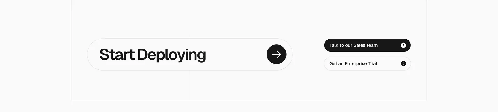
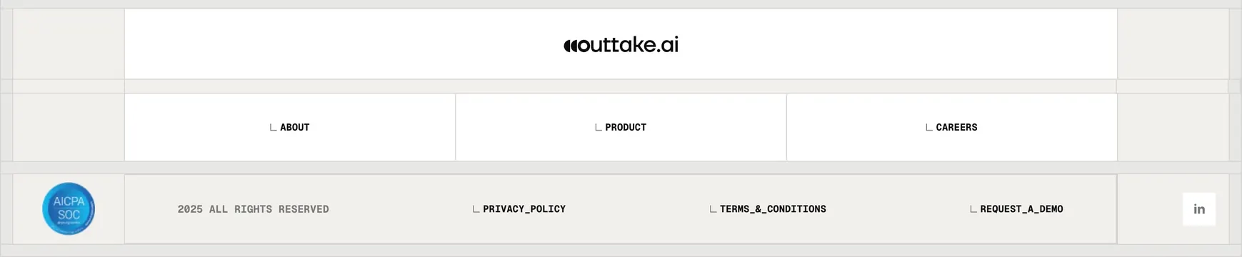
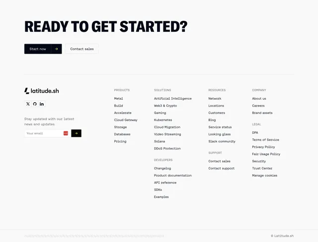
Light footer that opens with an oversized all-caps CTA then resolves into a brand-plus-newsletter block beside five columns of links.
Summary
A light footer that leads with an oversized condensed all-caps CTA and a dual button, then splits into a brand/newsletter block and five tightly-set columns of links, closed by a hatched bottom bar.
Visual description
Off-white background. The top zone is a large condensed all-caps headline "READY TO GET STARTED?" with two buttons below: a black "Start now" carrying a lime-green arrow, and an outline "Contact sales". A hairline rule separates the CTA from the footer proper. The lower zone places the latitude.sh wordmark, three social icons, and a "Stay updated" newsletter email field (with a small dark arrow submit button) on the left, then runs five label-headed link stacks across the right: PRODUCTS, SOLUTIONS (with a DEVELOPERS group beneath), RESOURCES (with a SUPPORT group), and COMPANY (with a LEGAL group). A faint diagonal-hatch strip and a "Latitude.sh" copyright line sit along the very bottom.
Key takeaway
Stacking a loud oversized CTA directly on top of the link footer collapses two sections into one and gives the page a strong closing beat. The single lime accent, used only on the primary button arrow and the newsletter submit, keeps an otherwise greyscale footer from going flat. Grouping sub-categories (Developers, Support, Legal) under their parent columns fits a long sitemap into a tidy five-column grid.
Reuse notes
A reusable end-of-page pattern for a content-heavy developer or infra site that needs both a final CTA and a full sitemap. The condensed all-caps headline and lone accent color tie it to a brutalist-leaning brand; on a softer brand the headline would want toning down. Keep the accent to one or two touches so it stays a highlight.