Preview image. Unlock full-res
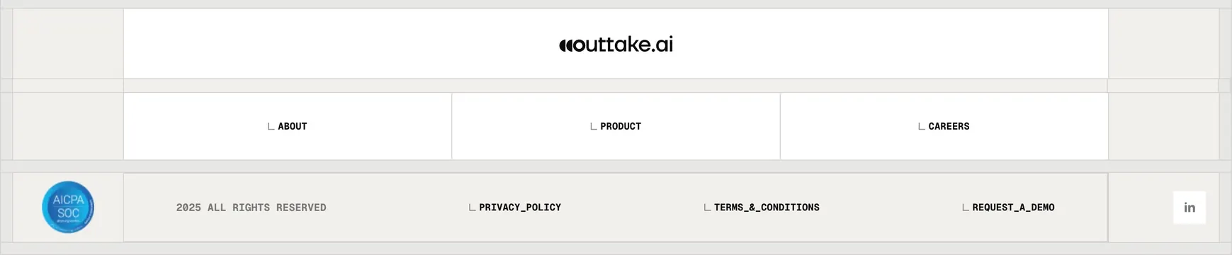
Light minimal footer built on a visible ruled grid, with a centered wordmark, three monospace nav cells, and a compliance badge.
Summary
A restrained light footer laid over an exposed ruled grid, with the wordmark centered in a top cell and navigation reduced to a few monospace, bracket-prefixed labels. The visible grid lines and tick marks are the whole aesthetic.
Visual description
The footer is divided into a tic-tac-toe of thin gray rules on a warm off-white ground. The top center cell holds the black "outtake.ai" wordmark. The middle band carries three evenly spaced all-caps monospace links, each prefixed with a small corner-bracket glyph (ABOUT, PRODUCT, CAREERS). The bottom band runs a baseline row: a circular blue "AICPA SOC" compliance seal at far left, then "2025 ALL RIGHTS RESERVED" and three more bracketed monospace links (PRIVACY_POLICY, TERMS_&_CONDITIONS, REQUEST_A_DEMO), with a small LinkedIn tile at the far right. Faint tick marks sit at the grid intersections; the palette is near-monochrome apart from the blue badge.
Key takeaway
Letting an exposed structural grid and monospace, underscore-styled labels carry all the personality, so a footer needs almost no color or imagery to feel designed. Surfacing the AICPA SOC seal directly in the footer is an efficient trust signal for a security product.
Reuse notes
Suits technical, security, or developer brands with a blueprint or terminal aesthetic and a short link set. The grid-and-monospace treatment can feel sparse if the site has many footer links, so keep navigation minimal. The compliance badge is the one spot of color; reuse where a real certification applies.