Preview image. Unlock full-res
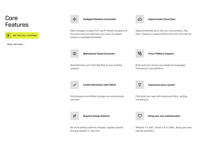
Light features section with a left heading-plus-buttons column beside a two-column grid of icon-led feature blurbs.
Summary
A light core-features section that anchors a stacked heading and two CTAs on the left, then lists eight icon-led features in a two-column grid on the right.
Visual description
White background. The left column stacks "Core Features" in a bold technical display face, a filled lime "SEE THE FULL PLATFORM" pill with a small glyph, and an outlined "READ THE DOCS" ghost button. The right area holds two columns of feature blurbs (four per column): each starts with a small grey rounded icon tile, a bold feature title beside it (for example Intelligent Rainbow Connection, Opportunistic Cloud Sync, Bidirectional Cloud Connector, Cross-Platform Support, Conflict Resolution with CRDTs, Expressive query system, Reactive Design Patterns, Bring your own authentication), a thin hairline under the title row, then a short muted paragraph. Generous vertical spacing separates the rows.
Key takeaway
Anchoring the heading and primary actions in a fixed left column while the feature grid scrolls beside it keeps the CTA persistent without a sticky bar. The grey rounded icon tiles plus a hairline under each title give every cell consistent structure without boxes.
Reuse notes
Ideal for a technical product that needs to list many capabilities concisely while keeping a "see everything" CTA in view. Works on a plain light background; the lime button is the only color, so it carries the brand accent. Best when each feature has a one-line description that fits two or three lines.