Preview image. Unlock full-res
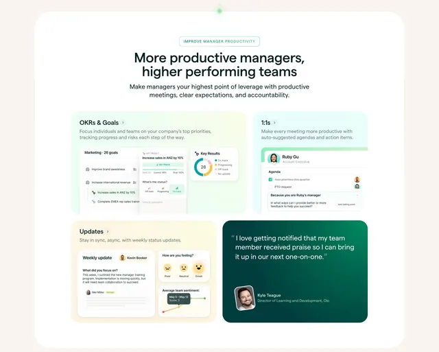
Pastel bento of product UI cards for OKRs, 1:1s and updates, anchored by a dark-green testimonial card, under a centered eyebrow and headline.
Summary
A bento grid of pastel feature cards, each carrying a real product UI snippet, with one dark-green pull-quote card breaking the light palette to add a customer voice.
Visual description
Centered at top: a small green pill eyebrow reading "Improve manager productivity", a bold two-line headline "More productive managers, higher performing teams", and a grey subhead. Below, a bento layout inside a large rounded white container. Top row holds two pale cards: "OKRs & Goals" (mint) showing a goals table and a key-results donut chart, and "1:1s" (pale green) showing an agenda UI with avatars. Bottom row pairs an "Updates" card (pale yellow) with weekly-update and team-sentiment UI against a dark-green testimonial card with a white pull quote and a headshot, name, and title. Each card has a small label, a one-line description, and a product screenshot.
Key takeaway
Letting every feature cell carry an actual UI fragment instead of an icon proves the product is real. The single dark testimonial tile inside the otherwise pastel grid is a smart way to inject social proof without a separate section.
Reuse notes
Strong features overview for a multi-feature SaaS that needs to show several modules at once. Requires polished UI crops in a shared visual style, or the grid looks busy. The dark accent tile trick works whenever you have one good quote and want it to pop.