Preview image. Unlock full-res
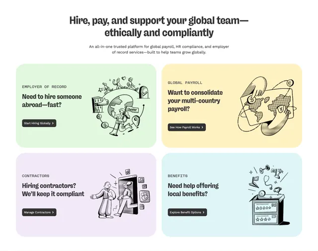
Centered headline over a 2x2 grid of pastel product cards with stippled line illustrations and black CTAs.
Summary
A homepage features block pairing a serif headline with four pastel product cards in a 2x2 grid, each using question-style copy, a black pill CTA, and a stippled black-and-white illustration.
Visual description
White page background with a centered headline in dark serif type: "Hire, pay, and support your global team�ethically and compliantly." A lighter sans-serif subhead sits below. Four large rounded cards fill a 2x2 grid with distinct pastel fills: mint green (Employer of Record), pale yellow (Global Payroll), lavender (Contractors), and sky blue (Benefits). Each card leads with a small all-caps category label, a bold question headline, a filled black button with white text and chevron, and a bottom-right stippled line illustration (globe with figures, hands holding a world map with currency coins, handshake through a phone, benefits items spilling from a box).
Key takeaway
Pastel card backgrounds as a soft way to differentiate four product lines without breaking visual unity. Pairing question headlines with one decisive CTA per card keeps scanning fast. The consistent stipple-illustration style ties disparate topics into one brand language.
Reuse notes
Strong pattern for multi-product SaaS homepages where each offering needs its own story. Works best with custom illustrations in a single technique; stock photos would clash. Needs generous card padding and wide desktop width to breathe.