Preview image. Unlock full-res
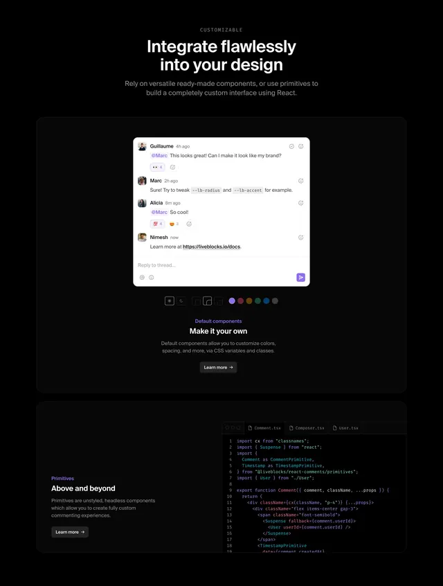
Dark developer section showing default comment UI with theme controls and a primitives code panel for custom builds.
Summary
Two-part feature band contrasting ready-made comment components with headless React primitives and live customization controls.
Visual description
Black page. Top headline "Integrate flawlessly into your design" with subcopy on ready-made versus custom primitives. Large dark card holds a white comment thread between four users with mentions, emoji reactions, docs link, and reply field. Below, control bar with sun/moon theme toggle, four border-radius options, and eight accent color dots. Purple "Default components" label, "Make it your own" title, CSS variables copy, Learn more button. Lower split card: left text on unstyled primitives, right code editor tabs showing Comment.tsx importing CommentPrimitive and TimestampPrimitive.
Key takeaway
Showing both polished default UI and code primitives in one scroll teaches the build-versus-buy decision instantly. Interactive-looking theme chips make customization feel tangible.
Reuse notes
Ideal for component library or API docs marketing. Needs legible code snippet. Best for developer audiences comfortable with React examples.