Preview image. Unlock full-res
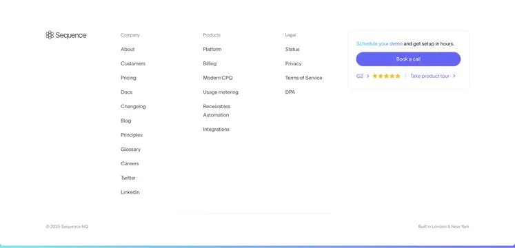
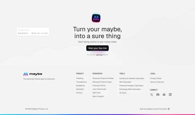
Light footer combining a centered final CTA with a logo and a four-column link list, closed by a full-width rainbow gradient bar.
Summary
A combined closing CTA and footer on a light field: a centered headline and dark pill button sit above a four-column link directory, with a thin full-width rainbow gradient strip sealing the very bottom.
Visual description
The upper half centers a colorful app icon above a two-line headline "Turn your maybe, into a sure thing," a grey sub-line "Start taking control of your money today," and a black pill CTA "Start your free trial," followed by a small "You can also self-host Maybe" line. A faint upward line chart and a floating value tooltip ("10 Mar 2025 / $65,818.45 +$394.91") sit behind the headline as light background texture. The lower footer has the "maybe" wordmark and tagline at left, then four labeled link columns (PRODUCT, RESOURCES, TOOLS, LEGAL) plus a CONNECT block with X, Discord, mail, and LinkedIn icons. A copyright row ("2025 Maybe Finance, Inc." / "Built by people around the world") sits at the bottom, and a thin full-width rainbow gradient bar runs edge to edge under everything.
Key takeaway
Merging the final CTA and the footer into one continuous light block so the page closes on an action, not just links. The thin rainbow gradient bar is a cheap, memorable brand sign-off that costs almost no vertical space. The faint chart texture ties the footer back to the product without a real screenshot.
Reuse notes
Good when you want the footer to do double duty as a last-chance conversion point. The rainbow strip is a strong brand cue but should match an existing accent palette or it will feel arbitrary. Light, airy treatment suits consumer finance and productivity tools.