Preview image. Unlock full-res
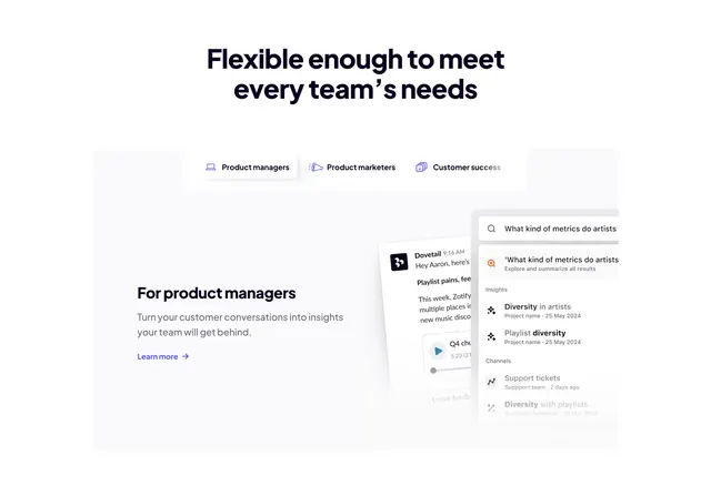
Centered-headline feature section with persona tabs and an off-frame stack of product UI cards showing search and insights.
Summary
A feature section organized by audience: a centered headline over a three-way persona tab bar, with body copy on the left and a stack of floating product UI cards bleeding off the right edge.
Visual description
A centered two-line headline ("Flexible enough to meet every team's needs") in heavy near-black sans sits above a pill-shaped tab bar with three icon-and-label tabs ("Product managers" active, "Product marketers", "Customer success"). Below opens a pale grey rounded canvas. Its left side holds a "For product managers" sub-heading, a short paragraph, and a violet "Learn more" text link with arrow. The right side is a layered, off-frame UI stack: a Slack-style message card with an audio-clip player and a tall global-search panel listing a typed query, an "Explore and summarize all results" row, and grouped Insights and Channels results with small icons. The mockups fade and crop at the right margin.
Key takeaway
Tabbing the section by who the user is (persona tabs) lets one feature block speak to multiple audiences without repeating itself. The off-frame, partially cropped UI cards imply a richer interface than the frame can hold and keep the copy side clean.
Reuse notes
Use when one capability needs to be reframed for different buyer personas. The active-tab content (copy plus mockup) should swap per persona, so budget for several UI states. The cropped mockups read best on a contained grey canvas rather than full-bleed.