Preview image. Unlock full-res
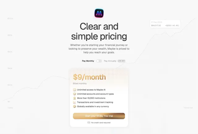
Single-plan centered pricing section with a billing toggle and one warm-gradient $9/month card listing five included features.
Summary
A centered, single-plan pricing section: an oversized headline, a monthly/annual toggle, and one warm-gradient card showing a $9/month price, five icon-led feature lines, and a gradient CTA.
Visual description
The section centers an app icon above a two-line headline "Clear and simple pricing," a three-line grey sub-paragraph, and a billing control "Pay Monthly [toggle] Pay Annually" with a "17% OFF" pill. Below sits one pricing card with a soft peach-to-cream gradient top panel: a large amber "$9/month" with "Billed monthly" beneath. Five feature rows follow, each with a small amber icon and label (Unlimited access to Maybe AI; Unlimited accounts and account types; More than 10,000 institutions; Transactions and investment tracking; Globally available in any currency). A full-width amber gradient CTA "Start your 14 day free trial" closes the card, with a small "No credit card required" line and card icon below. A faint grey line chart with dollar-axis labels sits behind the whole section.
Key takeaway
Committing to a single plan removes comparison friction entirely, and the billing toggle plus "17% OFF" pill still nudges toward annual. The amber gradient on both the price panel and the CTA gives one card enough warmth to stand alone without competing tiers. "No credit card required" sits directly under the button to kill the last objection.
Reuse notes
Best when you have one clear plan and want to project simplicity. Loses the cross-sell that multi-tier tables provide, so use only when the product genuinely is one price. The faint chart background ties it to the rest of a finance product's page; drop it in other contexts.