Preview image. Unlock full-res
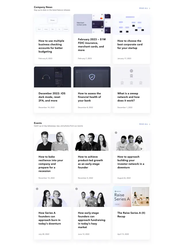
Two stacked blog index sections, Company News and Events, each with a three-column card grid and read-all link.
Summary
A blog directory page with separate Company News and Events blocks, each using identical card chrome but different visual treatments for product illustrations versus event photography.
Visual description
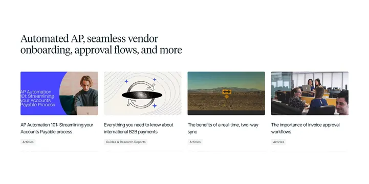
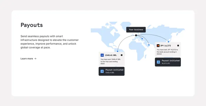
White page with two full-width sections. Each opens with a bold section title, one-line description, and a blue "READ ALL >" link aligned top right. Company News shows two rows of three cards with rounded corners, pale gray image areas, and soft blue-purple vector illustrations covering product updates, cards, dark mode, insurance, and security topics. Headlines and gray dates sit on white card bodies. Events repeats the same grid rhythm with black-and-white speaker photography, small circular Mercury marks on some cards, and one split card pairing gradient "Raise Series A" art with a color event photo.
Key takeaway
Reuse one card system across content types and swap only the media treatment. Matching grid density keeps news and events feeling like one product surface.
Reuse notes
Good template for a fintech content hub separating product announcements from community programming. Illustration cards need an internal icon style guide to stay cohesive.