Preview image. Unlock full-res
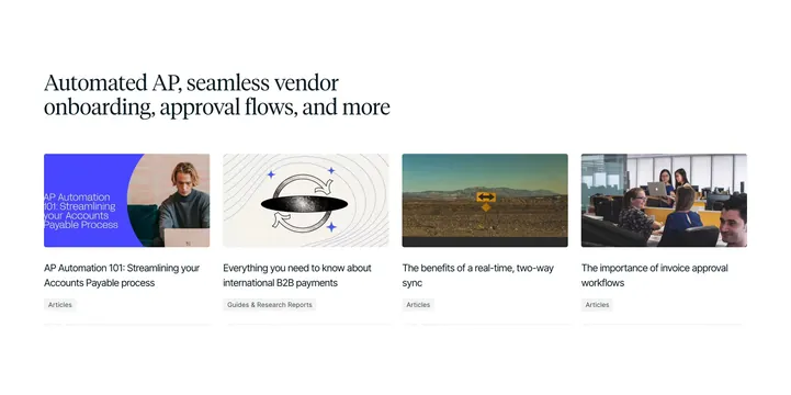
Editorial resource section with a large serif headline above a four-column row of article cards with mixed thumbnails and category pills.
Summary
Editorial resource section with a large serif headline above a four-column row of article cards with mixed thumbnails and category pills.
Visual description
White background with a left-aligned large serif headline reading "Automated AP, seamless vendor onboarding, approval flows, and more." Below, four equal cards in a horizontal row, each with a rounded-corner thumbnail, sans-serif title, and small gray category pill. Thumbnails vary: a blue circular graphic with laptop user for AP Automation 101, an abstract wavy oval with arrows for international B2B payments, a desert road with a two-way sign for real-time sync benefits, and an office team around a laptop for invoice approval workflows. Pills read "Articles" or "Guides & Research Reports." A faint dotted horizontal rule runs along the bottom edge of the section.
Key takeaway
Leading with a broad serif headline that lists product themes, then letting diverse card art styles coexist under one grid, keeps a resource hub from feeling templated. Small gray category pills add taxonomy without competing with titles. Mixed photography, illustration, and graphic thumbnails signal depth of content library.
Reuse notes
Good homepage capstone for content marketing on B2B SaaS sites. Works when you have four or more strong thumbnail concepts; unify with consistent card radius and pill styling. Collapses to two columns on tablet; headline may need shortening on mobile.
More blog list sections
See all











More like this



Keep what you find
A free account saves references to boards and can send you a weekly email of picks based on what you save.
To see every result, go Pro.