Preview image. Unlock full-res
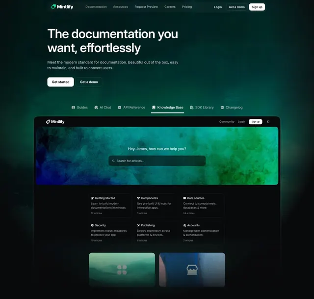
Dark left-aligned hero with a tabbed feature row and a large green-tinted knowledge-base product screenshot below the fold.
Summary
A dark, green-washed hero with a left-aligned headline and twin buttons, a horizontal feature-tab row, and a large knowledge-base product screenshot anchoring the section below.
Visual description
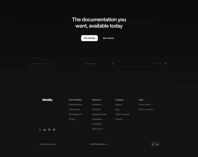
Top nav has the Mintlify logo left, Documentation/Resources/Request Preview/Careers/Pricing center, and Login/Get a demo/Sign up right. The hero copy is left-aligned: a two-line headline "The documentation you want, effortlessly," a short grey sub-paragraph, and two pill buttons (white filled "Get started," dark "Get a demo"). A horizontal tab row with small icons sits below (Guides, AI Chat, API Reference, Knowledge Base [active, underlined], SDK Library, Changelog). The lower two-thirds is a large product screenshot in window chrome: a dark knowledge-base UI with a green-and-blue watercolor search banner ("Hey James, how can we help you?" over a search field), a six-card grid of help categories (Getting Started, Components, Data sources, Security, Publishing, Accounts) each with an icon and article count, and two image tiles at the bottom. A subtle dark-green wash colors the whole background.
Key takeaway
The feature-tab row directly under the hero copy lets one screenshot stand in for many: each tab implies a different product surface while only one needs to be shown. The green watercolor search banner inside the screenshot gives an otherwise dark, technical UI a moment of warmth and color. Left-aligned copy with the screenshot full-width below reads as confident and product-forward.
Reuse notes
Built for documentation and developer platforms with a polished in-product UI to show. The tab row implies the screenshot could swap per tab, so it pairs naturally with a real interactive preview. Dark-green palette and low-contrast chrome only hold up on dark backgrounds.