Preview image. Unlock full-res
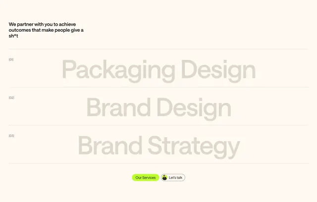
Cream services section with low-contrast oversized row titles, bracketed numbers, and dual CTAs.
Summary
A minimalist services list where three offerings read as full-width typographic bands separated by hairline rules.
Visual description
Light beige background. Small black intro top-left: "We partner with you to achieve outcomes that make people give a sh*t." Three horizontal bands divided by thin grey lines. Each band has a left-aligned bracketed index [01], [02], [03] in small grey type and a centered oversized service name in muted taupe: "Packaging Design," "Brand Design," "Brand Strategy." Bottom centered pills: filled lime "Our Services" and outlined "Let's talk" with avatar.
Key takeaway
Low-contrast giant titles on a neutral field feel editorial and confident; bracket indices add structure without icons.
Reuse notes
Service overview pages for studios with few clear offerings. Low-contrast text needs large size to stay legible.