Preview image. Unlock full-res
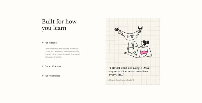
Split audience-selector feature with serif "Built for how you learn" headline and student-focused copy beside a graph-paper testimonial card with hand-drawn illustration.
Summary
A two-column learning-audience section where an expandable star-bullet list on the left pairs with a graph-paper testimonial card and hand-drawn study illustration on the right.
Visual description
Light cream background in a roughly 45/55 split. Left column carries a large black serif headline "Built for how you learn." Below, a vertical audience list with small four-point star prefixes. "For students" is active in black with an open gray sans paragraph about consolidating lecture materials and AI help when concepts do not click. "For self-learners" and "For researchers" appear below in lighter gray as inactive options. Right column is a tall card with a subtle light-gray grid pattern like graph paper. Top of the card shows a black line-art illustration of a person lying down looking up at two birds holding a banner reading "E=MC�," with a single pink wavy accent on the figure. Below, a serif quote reads "I almost don't use Google Drive anymore. Opennote centralizes everything." Attribution in small gray sans: "Vince, Graduate student."
Key takeaway
Inactive gray audience rows imply a tabbed interaction without showing every state. Pairing use-case copy with a real student quote on graph paper reinforces credibility and study context. One pink accent in a monochrome illustration adds warmth without breaking restraint.
Reuse notes
Strong mid-page section for edtech products serving multiple personas. Needs distinct testimonial content per audience if all tabs are built. Graph-paper card and hand-drawn art suit light academic brands; swap illustration style for other verticals.