Preview image. Unlock full-res
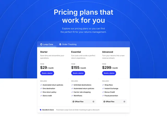
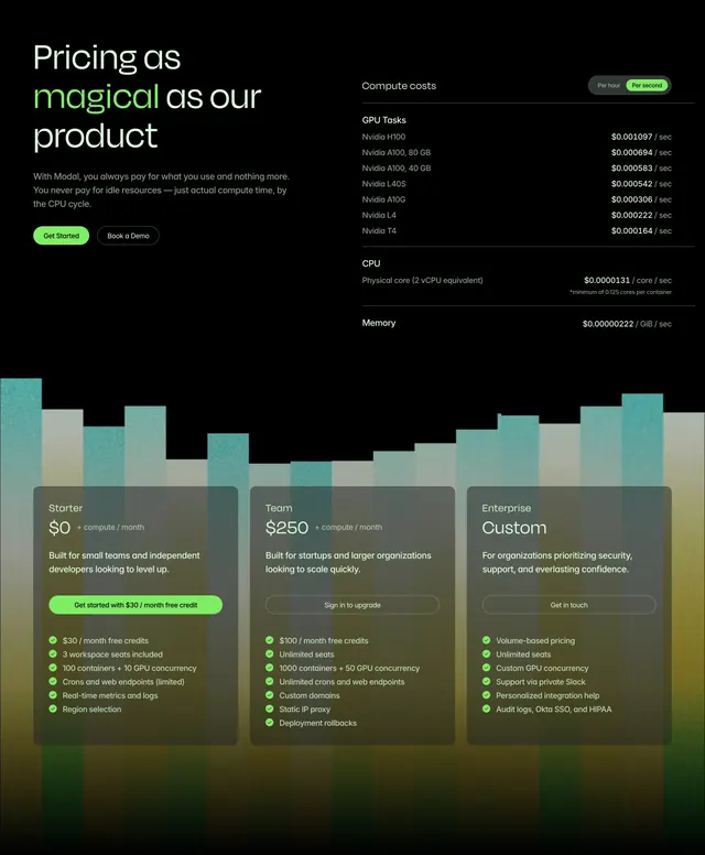
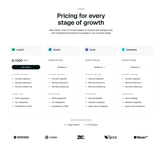
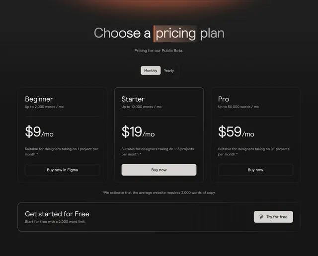
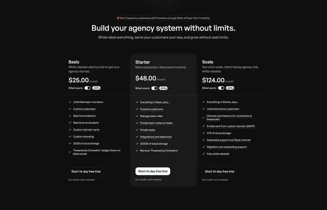
A dark three-column pricing block with a raised, lighter middle tier, per-card yearly toggles, checkmark feature lists, and a discount banner overhead.
Summary
A dark, three-tier pricing section that lifts the middle plan onto a lighter raised card, with a per-card yearly toggle, checkmark feature lists, and a small discount banner above the heading.
Visual description
Black background. A small pill banner offers a new-customer discount, above a bold centered heading ("Build your agency system without limits.") and one line of subcopy. Three pricing columns sit below: Basic, Starter, and Scale, each with a name, a one-line description, a monthly price, and a "Billed yearly" toggle with a -20% pill. The middle "Starter" tier is raised on a slightly lighter panel to mark it as recommended. Each card lists checkmark features (some underlined as upgrades) and ends in a "Start 14-day free trial" button with a "No credit card needed" note.
Key takeaway
Signaling the recommended plan purely with a lighter raised panel rather than a loud accent color, which suits a restrained dark palette. Repeating the yearly toggle and the no-credit-card reassurance on every card keeps the decision low-friction at the point of choice.
Reuse notes
A solid default for three-tier SaaS pricing. Underlining the upgrade features per tier helps buyers see what each step unlocks; keep lists scannable and aligned across columns. On dark, the raised middle card needs enough lightness to read as elevated without glowing.