Preview image. Unlock full-res
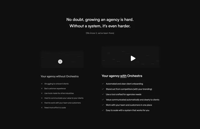
Dark two-column before/after comparison contrasting an agency without Orchestra against one with it, using crossed-out and checked list items under two media tiles.
Summary
A dark before/after comparison that sets "your agency without Orchestra" against "your agency with Orchestra" in two side-by-side columns, each topped by a media tile and a checklist. The defining move is the cross marks versus check marks running down the two lists.
Visual description
A two-line centered headline in white sans-serif sits above a parenthetical grey aside. Below, two equal columns each lead with a rounded dark media tile: the left tile carries a small grey question-mark badge over a faint blurred background, the right tile shows a white circular play button over a similar blurred frame. Under each tile is a column label, with the right one underlining the word "with" for emphasis. Each column lists six items: the left uses muted grey text with grey cross icons, the right uses brighter white text with check icons. The whole layout sits on a flat near-black ground with heavy negative space around it.
Key takeaway
The symmetrical without/with framing where the only visual difference between two parallel lists is cross icons versus checks and a slight brightness shift. Pairing a muted, locked "question mark" tile with an active "play" tile to imply the upgrade. Underlining a single word in a label to carry the contrast.
Reuse notes
Good for a mid-page persuasion block that contrasts the painful status quo with your product. Works best when both lists have matched item counts so the columns read as a true mirror. The video tile on the right implies a demo play; only tag motion if a real player is present.
More comparison sections
See all











More like this
Keep what you find
A free account saves references to boards and can send you a weekly email of picks based on what you save.
To see every result, go Pro.