Preview image. Unlock full-res
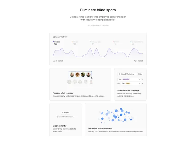
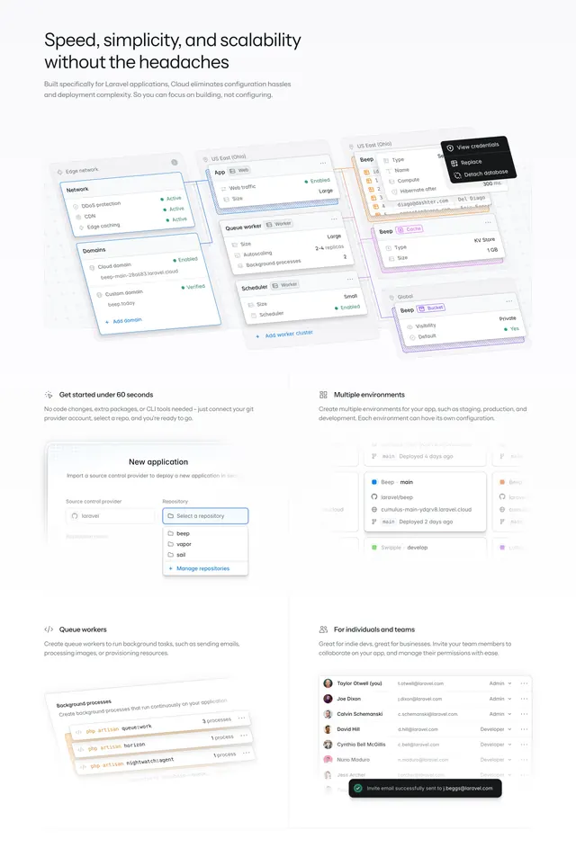
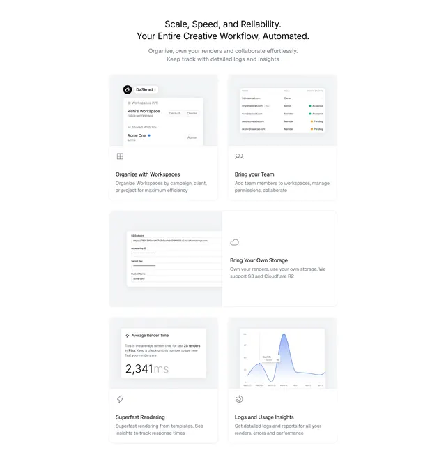
Light bento-style feature grid of six asymmetric cells, each pairing a faded product-UI mockup with an icon, label, and short description.
Summary
A light bento-style feature section: six unevenly sized cells, each showing a faded product-UI fragment up top and an icon, bold label, and one-line description at the base.
Visual description
Centered two-line headline "Scale, Speed, and Reliability. / Your Entire Creative Workflow, Automated." over two lines of grey sub-copy. Below is a bento grid of six cells in two columns with varied heights. Each cell pairs a light grey product-UI mockup (often faded or cropped) with a small outline icon, a bold label, and a grey caption: Organize with Workspaces (a workspace/permissions panel), Bring your Team (a member table with role and invite statuses), Bring Your Own Storage (an R2 endpoint/keys form), Superfast Rendering (an "Average Render Time / 2,341ms" card), and Logs and Usage Insights (a blue line-chart card). The mockups sit in soft-cornered tiles and fade toward white at their edges, keeping the grid light and airy.
Key takeaway
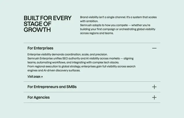
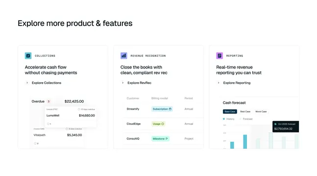
The bento grid with intentionally faded, partial UI fragments lets each cell hint at a real feature screen without the burden of pixel-perfect screenshots, and the soft fade-to-white keeps six busy mockups from overwhelming the layout. Varying cell sizes creates rhythm so the grid does not read as a flat table of equal boxes.
Reuse notes
Good for a product with many small capabilities to showcase at once (rendering, storage, team, logs). The faded-mockup treatment is forgiving of incomplete UI. Light, low-contrast palette suits a clean SaaS or developer tool; it would need rework to hold up in dark mode.