Preview image. Unlock full-res
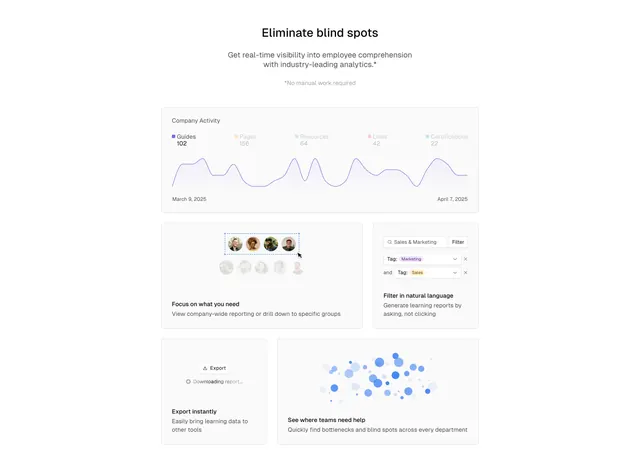
Centered features section laid out as a bento grid of UI snippets, including an analytics chart, an avatar selector, a natural-language filter, and an export card.
Summary
A centered features block built as a bento grid, where each tile is a small slice of real product UI demonstrating one capability. A wide analytics chart anchors the top.
Visual description
A centered black headline ("Eliminate blind spots") sits over two lines of grey sub-copy and a smaller grey footnote ("*No manual work required"). Below, a bento grid of rounded tiles on a white field: a full-width "Company Activity" card with a colored legend (Guides, Pages, Resources, Links, Certifications) and a purple line chart spanning a date range; a left tile showing a dashed-selected row of avatars labeled "Focus on what you need"; a right tile with a search field and "Tag: Marketing / Tag: Sales" chips labeled "Filter in natural language"; a small "Export" tile mid-download; and a wide tile with a blue scatter-bubble cluster labeled "See where teams need help". Each lower tile carries a bold caption and a line of grey description.
Key takeaway
Making every bento cell a literal product vignette rather than an icon, so the feature list doubles as a product tour. The mix of one large hero chart with several small interaction snippets creates rhythm and varied tile sizes.
Reuse notes
Best when you have polished UI you can crop into self-contained moments. Keep each tile to one idea with a short caption. The bento works on light backgrounds and scales down to two columns; the purple accent is easy to swap for any brand color.