Preview image. Unlock full-res
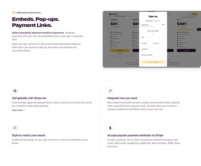
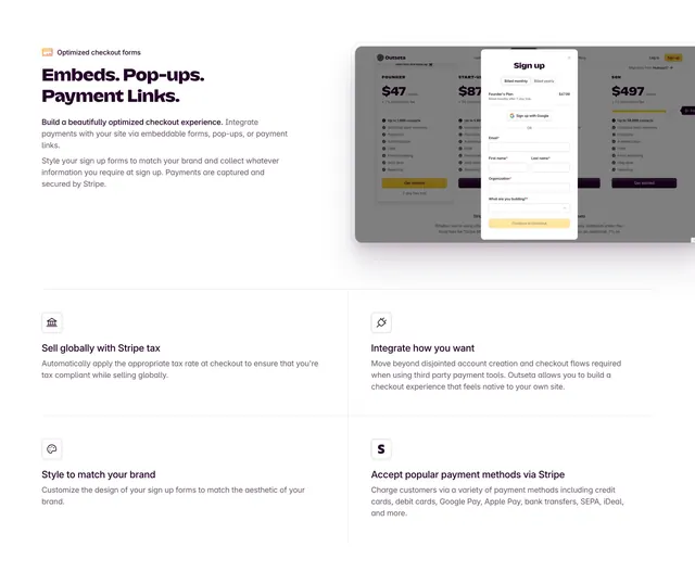
Split feature section promoting embeddable checkout with a modal signup mockup on the right and a four-cell benefits grid below.
Summary
An Outseta checkout feature block with copy about embeds, pop-ups, and payment links on the left, a layered signup modal screenshot on the right, and a ruled 2x2 grid of supporting capabilities below.
Visual description
White page with a top split: left side carries a small orange card icon label, a large three-part headline "Embeds. Pop-ups. Payment Links.", and two paragraphs of grey copy about branded checkout and Stripe security. Right side shows a dimmed pricing page behind a centered white signup modal with monthly/yearly toggle, Google sign-up button, stacked form fields (email, name, organization, dropdown), and a yellow "Continue to checkout" button. Below, thin horizontal and vertical rules form a four-cell grid. Each cell has a small grey icon box, bold subhead, and short paragraph covering Stripe Tax, flexible integration, brand styling, and popular payment methods via Stripe, with one "Learn more" text link in the first cell.
Key takeaway
Showing the checkout modal in context over a blurred pricing page makes the embed story tangible. The headline uses three punchy nouns separated by periods for rhythm. The 2x2 ruled grid extends one feature into four digestible sub-benefits without leaving the section.
Reuse notes
Useful for payment, auth, or form-embed products explaining multiple delivery modes. The modal-over-page composition needs a believable background page and a clean form state. Grid cells stay readable when each sub-benefit is one tight paragraph.
More feature detail sections
See all





More like this


Keep what you find
A free account saves references to boards and can send you a weekly email of picks based on what you save.
To see every result, go Pro.