Preview image. Unlock full-res
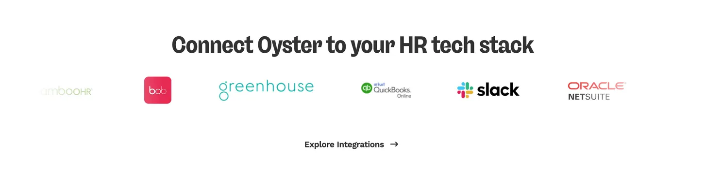
Minimal centered integrations band with bold headline, a single row of six HR partner logos, and a text CTA link below.
Summary
A sparse white integrations strip naming Oyster's HR stack connections with one centered headline, six partner logos, and an underlined-style text CTA.
Visual description
Pure white background with generous vertical padding. Centered bold dark charcoal sans-serif headline reads "Connect Oyster to your HR tech stack." Below, a horizontal row of six partner marks in their native colors: BambooHR in muted green wordmark, HiBob as white "bob" in a red-pink square, Greenhouse in thin teal type, QuickBooks Online with green qb icon, Slack with colorful hash and black wordmark, and Oracle NetSuite with red ORACLE over grey NETSUITE. Centered beneath the logo row, a bold dark grey "Explore Integrations" text link with a right arrow.
Key takeaway
Restraint: no cards, borders, or badges, just headline, logos, and one quiet link. Letting partner brand colors be the only chroma on an otherwise monochrome band signals ecosystem credibility without visual noise.
Reuse notes
Default pattern for integration or partner trust sections on B2B SaaS sites. Logo row will need horizontal scroll or a wrapped grid on mobile. Requires recognizable partner marks; weak logos make the section feel empty.
More integrations sections
See all











More like this
Keep what you find
A free account saves references to boards and can send you a weekly email of picks based on what you save.
To see every result, go Pro.