Preview image. Unlock full-res
Three stacked split rows pairing pastel illustration cards with bold benefit headlines and arrow text links.
Summary
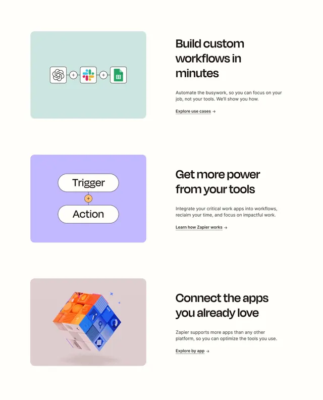
Three vertically stacked feature rows each pair a rounded pastel illustration panel with a bold headline, supporting copy, and underlined arrow link.
Visual description
Off-white page background with generous vertical spacing. Each row is a two-column split: left holds a rounded rectangle in mint, lavender, or dusty rose containing conceptual graphics (connected app icons for ChatGPT, Slack, and Sheets; Trigger and Action pills with orange plus; isometric colorful integration cube). Right column has bold black headline, gray body copy, and underlined text CTA with arrow for use cases, how it works, and explore by app.
Key takeaway
Pastel illustration tiles give each value prop a distinct color without breaking brand calm. Text-link CTAs keep the section educational rather than sales-heavy while the Z-pattern alternation maintains scan rhythm.
Reuse notes
Reliable homepage features pattern for integration or automation products. Illustrations must communicate the concept instantly; weak metaphors make the rows feel decorative.