Preview image. Unlock full-res
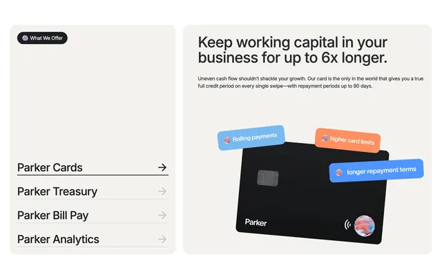
Two cream cards pair a vertical product menu on the left with a feature detail panel, 3D credit card, and floating benefit labels on the right.
Summary
Parker's "What We Offer" block uses side-by-side beige cards: a left nav list for product lines and a right detail pane with headline copy and a tilted 3D card surrounded by colored callout chips.
Visual description
Warm off-white page background frames two large rounded cream cards. Left card top-left has a dark pill badge with a colorful swirl icon and "What We Offer" label. Bottom half lists four products vertically: Parker Cards (active, bold with thick black underline and black arrow), Parker Treasury, Parker Bill Pay, and Parker Analytics (inactive items in gray with thin dividers and light arrows). Right card leads with a bold black headline on longer working-capital repayment, followed by a supporting paragraph on 90-day credit periods. Center-bottom shows a matte black 3D credit card tilted slightly, with chip, Parker wordmark, contactless icon, and a marble swirl sphere. Three rounded floating labels orbit the card: light blue "Rolling payments," orange "higher card limits," and bright blue "longer repayment terms," each with a small icon.
Key takeaway
The left menu acts as lightweight tab navigation while the right card stays visually rich with one hero object and orbiting benefit chips. Pastel surfaces keep a dense fintech story from feeling heavy.
Reuse notes
Strong pattern for multi-product fintech or platform sites explaining SKU-style offerings. Expects at least three to four menu items and a render or mockup that can carry floating annotations. Light backgrounds only; the cream panels need contrast from the page fill.
More features sections
See all











More like this
Keep what you find
A free account saves references to boards and can send you a weekly email of picks based on what you save.
To see every result, go Pro.