Preview image. Unlock full-res
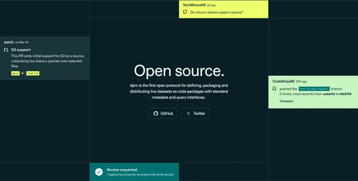
Dark centered open-source pitch surrounded by four GitHub-style activity notification cards in lime and teal.
Summary
A developer-tool CTA that sells open source with oversized white type and faux GitHub notifications orbiting the central message.
Visual description
Near-black background divided by subtle dark grid lines. Center stack: large white headline Open source., gray body copy about dpm as an open protocol for data packages, then two outlined buttons with GitHub and X icons. Four rounded activity cards float around the center on the grid: lime-green comment card top (user avatar, timestamp, question about column aliases), dark teal PR card left (patch user, S3 support title, merge branch detail), light green push card right (branch push summary with Compare link), and a teal approval bar bottom (checkmark icon, review requested message). Cards mimic real GitHub notification styling with small avatars, muted metadata, and monospace branch names.
Key takeaway
Using live-looking dev-community activity as decorative social proof instead of logos or testimonials. The grid-plus-floating-cards layout keeps a simple two-button CTA from feeling empty on a dark page.
Reuse notes
Ideal for open-source or developer platforms where GitHub presence is the conversion path. Needs credible-looking activity content; generic lorem breaks the illusion. Color accents (lime, teal) should stay consistent with the rest of the Patch brand system.