Preview image. Unlock full-res
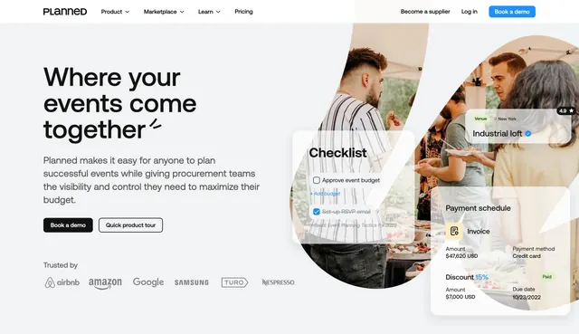
Split hero with oversized headline, dual CTAs, logo strip, and lifestyle photos overlaid with floating product widgets.
Summary
Planned's homepage hero pairs a large left-aligned headline and demo CTAs with event photography and three floating UI cards showing checklist, venue, and payment tasks.
Visual description
White page with top navbar: PLANNED wordmark, Product/Marketplace/Learn/Pricing links, Become a supplier, Log in, and blue Book a demo button. Left column: oversized black headline "Where your events come together" with a small decorative flourish, gray subcopy about planning and procurement visibility, black filled "Book a demo" and white outlined "Quick product tour" buttons, then "Trusted by" with monochrome logos for Airbnb, Amazon, Google, Samsung, Turo, and Nespresso. Right side: curved organic shapes framing outdoor event photos with three semi-transparent white widget cards layered on top showing a checklist with checked items, a venue card rated 4.9 in New York, and a payment schedule with invoice, discount, and Paid badge.
Key takeaway
Real event photography plus floating product cards sell the platform in context without a single full screenshot. Logo strip immediately below CTAs adds enterprise credibility. Black primary CTA with ghost secondary keeps hierarchy obvious.
Reuse notes
Works for vertical SaaS where the product touches real-world workflows. Needs quality photography and believable widget content. Organic crop shapes soften an otherwise corporate layout.