Preview image. Unlock full-res
Light features section that leads with a large analytics dashboard mockup, then breaks the product into four icon-led feature columns below.
Summary
A light features section anchored by a realistic analytics dashboard mockup, with a four-column icon-led feature breakdown sitting beneath it. The dashboard does the heavy lifting and the copy stays minimal.
Visual description
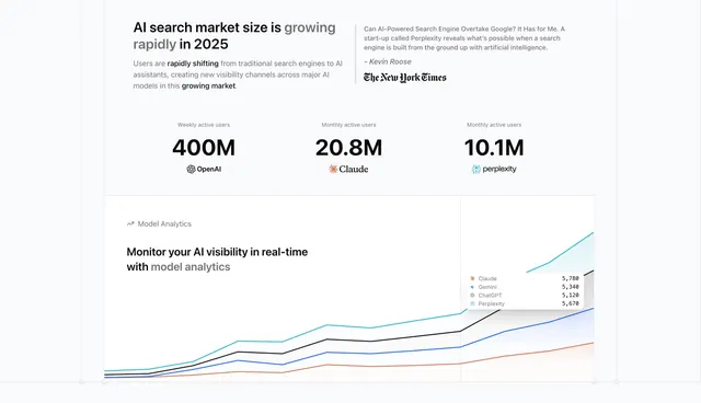
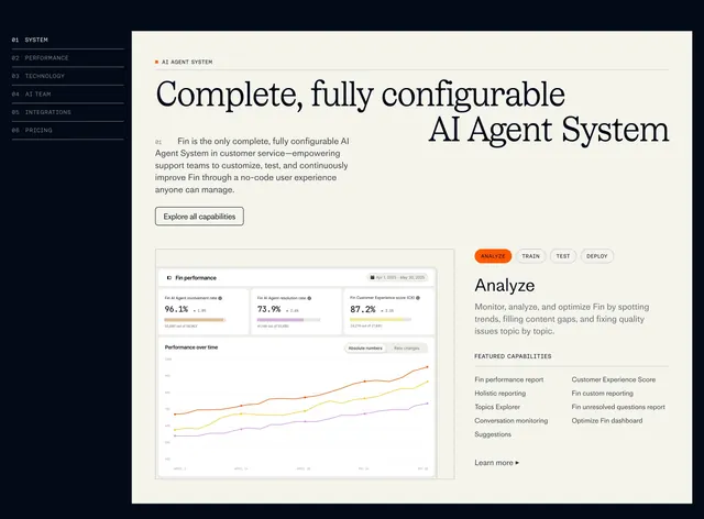
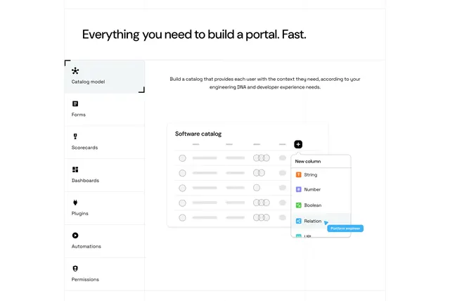
A split header opens the section: a large two-tone headline ("The platform for your AI monitoring and optimization", second clause greyed) on the left, a short muted paragraph with bolded keywords on the right. Below sits a near-full-width product dashboard with a left sidebar (Dashboard label, Analytics/Monitors/Prompts/AI Overviews nav items, a green "New" badge), a titled "Miro AI Traffic Analytics" panel with a live-visitor dot, four inline KPI pills, a multi-line area chart in teal/black/blue/orange, and a row of four stat tiles (Total Queries, Website Visitors, Avg. Time on Site, Top LLM) each with a green delta. Under the dashboard, four feature columns (Analytics, Monitors, Prompts, AI Overviews) each pair a small line icon and bold label with two lines of grey body copy.
Key takeaway
Letting one detailed, believable dashboard carry the whole section so the surrounding copy can stay sparse. The four-column icon row beneath restates the product's pillars without competing with the visual. Two-tone headline (active phrase black, qualifier grey) is a clean way to add hierarchy inside a single line.
Reuse notes
Strong fit for an analytics or AI-monitoring SaaS that has a genuinely screenshot-worthy dashboard. Needs a real, data-rich UI to look credible; a thin or fake-looking chart undercuts it. The bottom feature row scales to three to five columns and works equally well on its own as a standalone features block.