Preview image. Unlock full-res
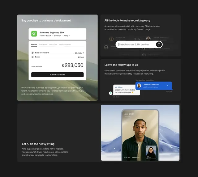
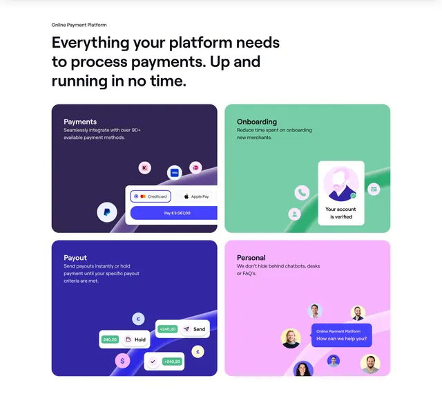
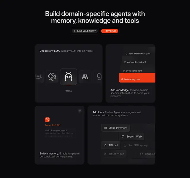
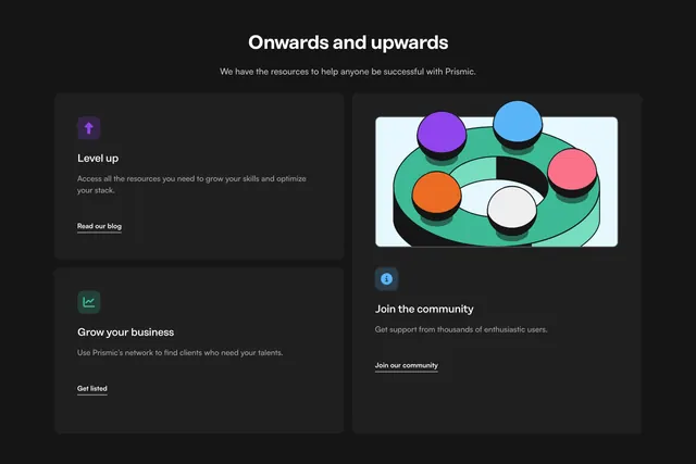
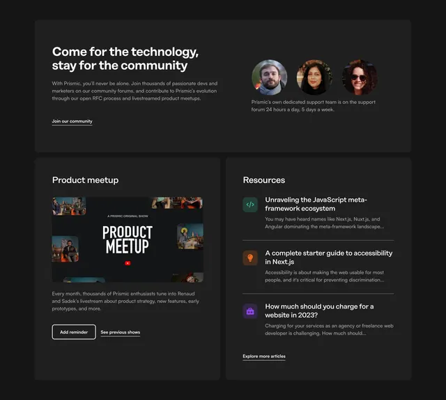
Dark three-part bento with a full-width community CTA on top and Product meetup plus Resources article list below.
summary
Dark bento section combining a community pitch card, a Product meetup promo with YouTube-style graphic, and a Resources list of three blog previews with colored icons.
Visual description
Charcoal page background with three dark rounded cards. Top full-width card: "Come for the technology, stay for the community" headline, body about forums and RFCs, underlined "Join our community" link, and three circular avatars with support-team caption on the right. Bottom left: "Product meetup" card with a stylized show graphic (thumbnails, "A PRISMIC ORIGINAL SHOW," red YouTube play icon), description of monthly livestreams, outlined "Add reminder" button and underlined "See previous shows." Bottom right: "Resources" card listing three articles with green, orange, and purple square icons, titles, snippets, and "Explore more articles" link.
Key takeaway
One bento grid covers community, events, and content without three separate sections. Colored icon squares make a text-heavy resources list scannable on dark cards.
Reuse notes
Ideal for SaaS homepages balancing dev community and content marketing. The meetup card needs a strong thumbnail graphic; placeholder art weakens the grid. Underlined links maintain editorial tone on dark UI.