Preview image. Unlock full-res
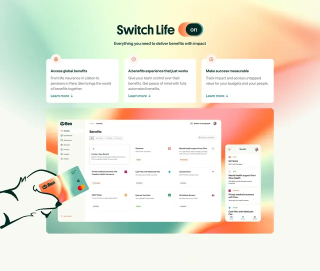
Toggle-headline feature section with three benefit cards above a gradient stage showing desktop dashboard, mobile app, and physical Ben card.
Summary
Switch Life headline with an on toggle, three white feature cards, and a large gradient showcase of desktop benefits UI, mobile app, and a hand-held Ben debit card.
Visual description
Cream top area: Switch Life title with orange on toggle, subhead about delivering benefits with impact. Three rounded white cards with orange icons cover global benefits, automated experience, and measurable success, each with teal Learn more links. Below, peach-to-mint gradient backdrop frames a large desktop Benefits dashboard (sidebar, filter tabs, benefit cards with Active/Processing badges), overlapping mobile benefits list, and line-art hand holding a gradient Ben business debit card with Mastercard mark.
Key takeaway
Brand toggle metaphor in the headline ties product naming to UI. Three teaser cards above a rich product montage sell breadth then prove depth. Physical card illustration anchors a digital platform in something tangible.
Reuse notes
Ideal for platform overview sections needing desktop, mobile, and hardware proof in one frame. Gradient stage unifies disparate assets. Dense lower half needs short top cards to stay scannable.