Preview image. Unlock full-res
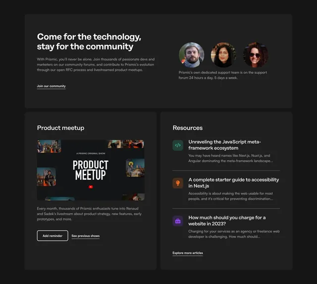
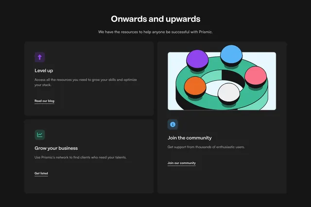
Dark bento-style resources section with two stacked link cards on the left and a tall community card with 3D ring illustration on the right.
summary
Centered "Onwards and upwards" header above a dark asymmetric bento grid of three resource cards, each with a colored icon, short copy, and underlined text link.
Visual description
Deep charcoal background. Centered white headline and gray subhead about Prismic resources. Below, a bento layout: left column stacks two dark rounded cards ("Level up" with purple arrow icon and "Grow your business" with green chart icon), each ending in an underlined link. The right column is a taller card topped by a light-blue panel with a 3D green ring and five colored spheres, then "Join the community" copy with a blue info icon and underlined CTA. Cards use subtle borders and generous internal padding.
Key takeaway
Asymmetric bento gives hierarchy without tabs: two quick links plus one hero community card. Colored square icons on dark cards create scannable entry points without heavy imagery on every tile.
Reuse notes
Good for developer docs or onboarding pages that need multiple paths forward. The tall right card works best with one strong illustration; shrinking it breaks the bento balance. Underlined links keep the section feeling editorial rather than button-heavy.