Preview image. Unlock full-res
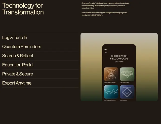
Dark brown feature section listing six app capabilities beside a rounded phone mockup showing a four-tile logging grid on a soft green gradient.
Summary
A chocolate-brown capabilities block with "Technology for Transformation" headline, philosophy blurb, six-item feature list, and a phone UI mockup in a rounded frame on a sage gradient.
Visual description
Dark chocolate-brown background with cream sans-serif type. Top left: large "Technology for Transformation" title. Top right: paragraph explaining the app as a partner in conscious living, not endless scrolling. Below: two columns. Left: vertical list of six features separated by thin dark dividers: Log & Tune In, Quantum Reminders, Search & Reflect, Education Portal, Private & Secure, Export Anytime. Right: large rounded frame with muted green-to-brown gradient containing a mobile screen. App header shows circular logo, "CHOOSE YOUR FIELD OF FOCUS", and "TAP TO TUNE IN". 2x2 grid of square tiles with distinct icons and labels: LOG MANIFESTATION (copper sunburst), LOG GRATITUDE (sage concentric ovals), LOG SYNCHRONICITY (teal sine wave), LOG DREAM (navy nested squares).
Key takeaway
A plain text feature list on dark ground contrasts cleanly with a single product mockup that shows the core interaction pattern. Each tile uses a unique color and icon so the grid reads as four distinct rituals, not generic buttons.
Reuse notes
Strong for mindfulness or journaling apps explaining capabilities without feature bloat. Needs a real UI mockup; placeholder tiles will look generic. Works best on dark sections with one adjacent visual.