Preview image. Unlock full-res
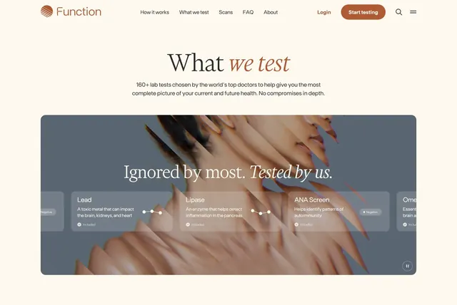
What we test page intro with serif headline and a dark carousel panel showcasing included lab tests over anatomical artwork.
Summary
The What we test page opens with a centered headline and supporting copy, then a dark rounded feature panel cycling lab test cards over stylized anatomical imagery.
Visual description
Cream page with full navbar: Function logo left, links for How it works, What we test, Scans, FAQ, About center, Login, terracotta Start testing button, search, and menu icon right. Below, centered large serif title "What we test" with rust italic emphasis on "we test," then gray sans paragraph citing 160+ doctor-chosen lab tests. A large dark rounded rectangle dominates the lower section with abstract warm-toned anatomical face and neck rendering on a blue-gray field. White oversized serif overlay reads "Ignored by most. Tested by us." A horizontal row of semi-transparent dark cards peeks below: Lead with toxic-metal description and checkmark Included plus sparkline; Lipase with pancreas inflammation copy and Included; ANA Screen with autoimmunity copy, Included, and Negative pill badge; partial Omega card at the right edge implying carousel. Small circular pause icon sits bottom-right of the panel.
Key takeaway
Using cinematic anatomical art as the carousel backdrop elevates a lab-test list from spreadsheet to story. Semi-transparent cards with Included badges and mini sparklines make each test feel like a product tile, not a bullet.
Reuse notes
Strong for health, biotech, or diagnostics brands with a broad test menu. Carousel needs enough items to justify horizontal scroll. Pause control suggests motion; provide static fallback. Navbar is incidental context from the full-page capture.